Tuesday, 4 October 2011

It's A Sign: Quite Some Free Gift! With a layout too

Hola.
Never let it be said that I'm not a multi-tasking blogger, because today I bring you a single post which manages to combine:
  • a funny sign for my It's A Sign feature;
  • my 3DJean Design Team project;
  • a scrapbook page AND ...
  • a splash of purple to fit in with Purple Phase [which now has it's own page tab ^^ up there containing a list of all the posts so far].
Oh and I'm also experimenting with a new LinkManger thingy at the bottom of this page ... so all in all this is one packed post.

So, while I have a short nap to recover from the exertion you can have look here, at the sign I spotted above the door of the printing press in the Edwardian Town at Beamish:
Isn't the English language an amazingly flexible thing? While I'm certain the signmakers hadn't intended my interpretation of it ... the idea that if I went round the back I'd be supplied with my very own agent or newsboy well ... that made me laugh!

It also made me want a photo of me with the sign ...the next best thing if I wasn't actually going to get an agent or newsboy to bring home! ;-)

Now here's the page I made to record it:
The journaling is written on some office supply labels while the titling is a combination of October Afternoon and Making Memories alphas. I bought 4 packs of the same colour of the latter in a cheapy bumper pack from TKMaxx and, rather than have 400 identical pink letters to use up, I've coloured over some of them with ProMarkers to match my page:
For a little embellishment cluster at the top I used a chipboard frame from a Collections Elements micro-book [listed below] and a strip of purple paper to balance out the similar strip at the bottom of the page. It also co-ordinated with the purple Shimmerz inks I sprinkled across the page, especially around the chipboard stars:
All of the illustrations plus the snippets of wording were taken from a vintage comic book story ... which possibly wasn't originally about a shop which supplied newsboys ... but hey that's what 'artistic licence' was invented for:
The chevron design fabric strips are Studio Calico 'FabRips' which are quite expensive ... for an embellishment [IMO] but I love them, so I treated myself. I used every last tiny scrap of the last packet I had and imagine I'll be doing the same with this one too!
Appropriately enough, due to the newspaper theme of the photos, the Chinese text I used on the stars and tucked down at the was torn from a free Chinese newspaper I spotted on a stand at work which I walked past one morning. It was on my mind all day, so I made sure that, before I left - and when I had a bag with me - I'd return to collect one. First I had a quick scan around to check no one was looking, then I swiped one and stuffed it into my bag in one swift movement.

Considering they were free papers I don't know what I was worried about ... possibly a fear of being questioned about whether or not I could read Chinese! Which of course I can't!  And really, I didn't feel like explaining to someone that I didn't want to read it ... I just wanted to use it in my crafting because ... y'know ... it like .. looked sort of ... cool ....?

Because I don't think they'd have understood. But you do ... don't you?

Thanks for reading here today.

Julie :-)

-----------------------------------------

 Here are the  3DJean supplies I used on this page:

Monday, 3 October 2011

Purple Phase: purple with plum, fuchsia and cream

Hi, hi.

I completed all my pages for my Learn Something New Every Day journal at the weekend, which I'll share here later in the week but before then I thought I'd use one of my pages as the inspiration for today's 'using purple with ...'  colour palette. So here it is:
I really like this combination as it's an extension from the idea of using purple with neutrals which I've talked about already. Here, the cream helps lend an additional warmth to the plummy shades and the bright pink which could have easily been the base of a cooler colour-combination.

Imagine this page minus the touches of cream running diagonally from top left to bottom right:
I think it would still have worked, but it would have been a cooler scheme where the blues would have been more predominant.

btw: You should know that I didn't plan any of this before starting my page, it's just how it evolved. As you may have gathered by now - especialy if you read the post I did showing a page from start to finish -  I'm fairly free and easy with my journaling approach, things get torn, splattered, smeared and splashed around with my main concerns being telling a story/creating a theme  ... and enjoying myself. So don't imagine I'm sitting there chained to a colour-theory book!

My use of colour on all my LSNED pages came from two key things:
  • the colours in the papers I'd glued down in advance of starting the individual pages; and
  • the colours within the main images and wording I'd selected for the page.
These are the things couldn't be changed: I couldn't peel off the base layers without spoiling the book and I wasn't willing to use an image which didn't really fit my theme solely because the colour matched. Therefore I used additional accents of colour to help pull the scheme together.

Whether on a journal page, a scrapbook layout etc or in an outfit you're wearing, repeating the colours across the scheme always helps the overall look appear cohesive.

Notice how:
  • the red + white patterned strip [from a security envelope] mirrors the red + white of the space rocket:
  • the light blue ink splatters lift out the paler blue of the rocket flames and the blue/green areas on the little face below;
Then, once I'd added this face sticker [because it fit perfectly inside the spacesuit] I wanted to repeat the use of purple somewhere else on my page, to tie it in. So I added a purple heart:
And finally, that splash of plummy/pinky/purple Shimmerz Spritz at the bottom was a way to repeat the colour of the "now why no try something new?" wording I'd cut from a magazine.
 [I apologise it all these comparisons mean you've been scrolling up and down like a crazy person!]

----------------------------------------------------
Even if you're not interested in art-journaling, I hope the palette itself is useful to you, whether for a craft project, a home decor idea or an outfit you put together:

And if you're stuck with how to combine several new shades together:
  • Try out the idea of repeating the same shade in a few places across your project or outfit.
  • Whatever colour you add [eg. purple!] - make sure you add it again, somewhere else, too;
  • Even a tiny splash of the same colour elsewhere, [eg. earrings, gloves, bag-charm, paper flower, sticker etc] will bring surprisingly impressive cohesion and balance to the whole scheme;
If I sound evangelical about this .. it's because I am!
  • It's the single most important colour-rule I follow.
  • I rely on it when I'm introducing new colours to any existing scheme.
... and I'm sure it can work for you if you give it a go ... it even works with purple! ;-)

--------------------------------------------------
Don't forget you can:
--------------------------------------------------

I'm going to be back here tomorrow with a 3DJean Design Team project complete with a 'sign' and then later on in the week I'll post the remainder of my LSNED journal pages.

And to everyone who left a supportive comment on my 'from start to finish' post - thank you!And thanks for your thanks!

Julie :-)

Saturday, 1 October 2011

My Month in Numbers 2011: September

Hello hello.

Another month brings another Month in Numbers round-up so let's start with a photo taken exactly one month ago: 
Looking back at this written-in-sand reminder I've just now thought how it might have made an interesting project to take a photo on the 1st of each month in a similar way ... telling a story of where you were ... but it's a bit late for that ... I should have remembered before it got dark and I still had time to experiment! maybe next month ...

Anyway, when I took that photo ... as well as '1.9.2011' being significant, so was this number ...

22 years = approximately [but I could be wrong] the number of years it's been since I've visited the 'seaside' with my both parents. [Mam, Dad, if you can correct me on that figure please do ... but think ... have we all been on a beach at the same time since Florida?].
 And the reason we were at the beach was so that this little lovely:
... could dig and splash. Which he did.

He also stood very still and let me hold him out of the way while a big dumper truck type thing drove along the sand mainly because ... he thought it was being driven by Bob the Builder!

I think I was as delighted as he was when the man [complete with convincing Bob-like hard-hat] waved at us as he passed by! Aren't people great?

4p = the exorbitant amount of money James and I spent in an arcade at Whitby:
We don't often visit the arcades but hey, call me a wild spontaneous kid if you will, but this particular occasion I threw caution to the wind and decided to go in and spend all the copper I had in my purse.

Which was 4p. 2p each. 1 go each on the 2p push machines.

Unsurprisingly ... we didn't win anything.  

9 = the number of pages my work appears on in the issue of Creativity which was released this month: 
Receiving this particular issue was double exciting for me as one of the photos of my projects was taken by me in our back garden and they liked it enough to print it! If you've got a copy it's the one with the glittery Halloween bats dangling on a gate!

Speaking of dangly things ...

1 = the number of mice caught on camera in our greenhouse banqueting on bird food ... by sitting in the bag James had haning up in there!:
What a life! If that was me ... and if the bird food was ready salted crisps ... if only ...

Well I think that's all of my numbers for September really ... because I think I've exhausted its happenings by blogging my Learn Something New Every Day journal pages throughout the month.

If you're new to the whole idea you can catch up here and if you decide to play along and blog your own numbers just yell out and I'll swing by. You can join in any time at all - it doesn't need to be the end of the month and I'll edit this post to add you in so others can come and visit you and your numbers too.

Those who've joined in with their September numbers so far include:
--------------------------------------------------------------------------
Now let's get stuck into October shall we?

It's only the 1st day but for me, it's started so well ... I'm wearing a summer dress [in this freakish yet beautiful weather] and I've eaten a raspberry pannacotta so that's a fighting start if ever I saw one!

I'll see you very soon as I have the next Purple Phase palette plus the final installment of my LSNED journal pages and another It's A Sign post on their way next week.

Until then ... happy new month to you!

Julie :-)

Thursday, 29 September 2011

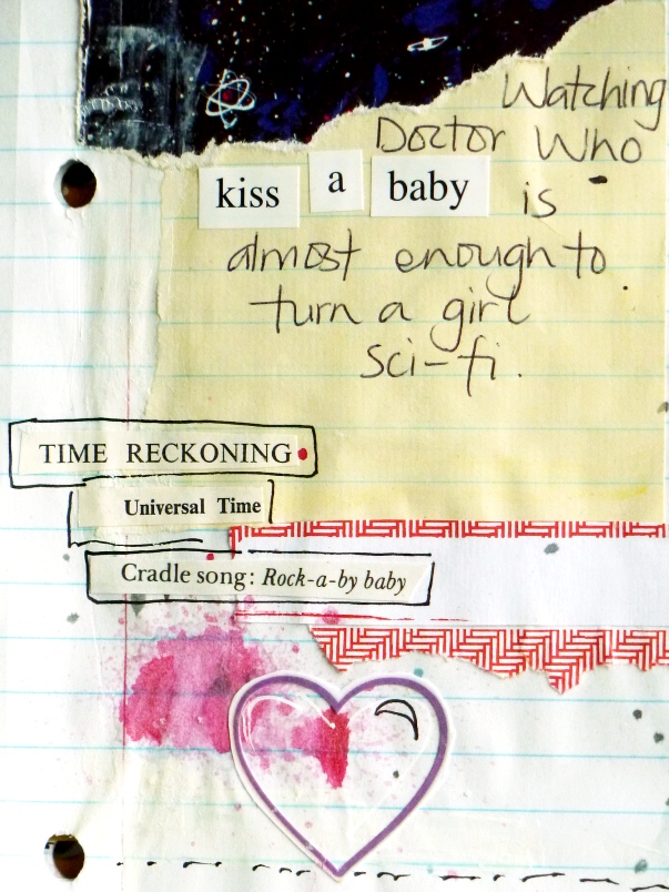
An Art Journal Page: from start to finish

Hi, hi, hi.

Well, it turned out that some of you were indeed interested in me posting a tutorial on the kind of pages I've been making in my Learn Something New Every Day journal. Which was nice, because really, you could have just shrugged saying "Meh. Whatever." when I put the idea out there!

So, for those of you who'd like to see how this page came into being:

Then this is for you:

I should just maybe say:
  • It's not an in-depth look at art-journaling or scrapping or even LSNED in general;
  • It's just a look at the process behind constructing a page for this particular journal [although seeing as how I'm a bit in love with the style it's going to appear in other journals without a doubt];
  • It's a bit of a photo-heavy post - just so you know.
  • If you'd find it beneficial to scrap lift / journal-lift straight from my page and produce a very similar page of your own - to get you started - feel free - that's what I've made the tutorial for.
Step 1:  Prepare a base layer with mixed papers: 
As I've mentioned several times now, I prepared the first layers of all 30 of my LSNED journal pages in advance of getting to the 'interesting' bits.

Glue approx. 3 roughly cut or torn sections of paper in a fairly random manner on the page of a notebook.
I used:
  • an old book page;
  • the inside of a security envelope;
  • a scrap of patterned paper;
  • Glued down with Daler Rowney 'Matt Glaze Medium'.
Once I'd done this on all 30 pages, in advance, I knew I had a fighting chance of getting this 'daily' project completed.
  • It meant I could sit in front of the TV, or at the dining table with relatively few supplies at hand, as I already had a workable base. However ...
  • I've also been made aware that this style of working could be useful if you're a crafter with a disability, as it's a way of breaking a page up into manageable chunks.
Thanks so much to the commenter who brought this to my attention as it perfectly draws together my two-strand working life: crafting and working with people with disabilities. I'd be thrilled if this method of working means you feel comfortable making a start, knowing that it can be done in stages as and when you want to or feel able to.

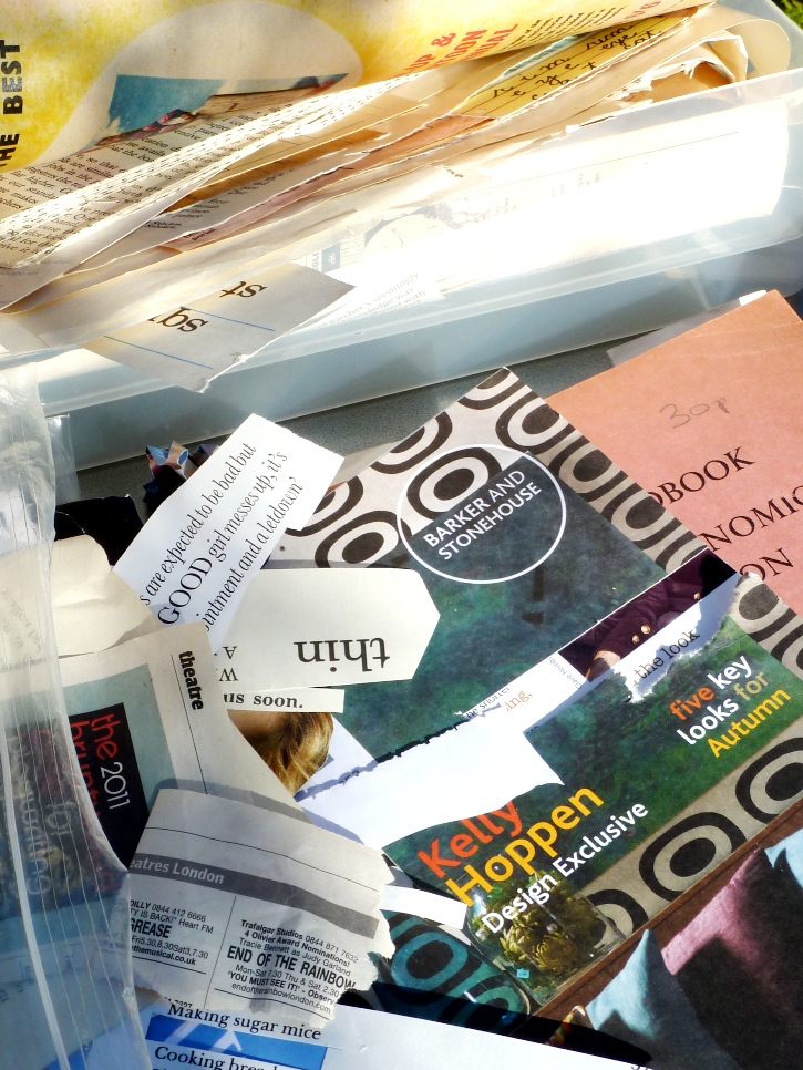
Step 2: Look through magazine clippings, catalogues and ephemera for focal images to suit the theme and feel you'd like the page to have:
Step 3: Select the ones which fit best or which speak to you most.

  • Trim around them and experiment with where they'd work best on the page.
  • Glue them down.
  • [I mostly only ever use a plastic glue-spreader rather than a brush as it means I don't have to have any water handy - I just wipe it with kitchen roll or let the glue dry on and pick it off when it gets too bulky! It saves time and is easier to manage if you're working quickly or on your knee in front of the TV!]
Step 4: Add additional, interesting scraps of paper/labels/ephemera - in colours which match what you've glued down so far:
  • Try overlapping some of your magazine clippings with these new elements;
  • This helps pull everything together, anchoring your images rather than having them floating around.
Step 5: Sift through magazines, catalogues, old books etc for wording which suit your theme / feelings / thoughts for the page:
  • Look out for key words or phrases which can help tell your story.
Step 6:  Look for words or phrases you can combine to create your own sentences:
  • Glue them down, again try overlapping existing snippets for a more interesting composition:

Step 7: Cover up some of the text on the old book page with white acrylic paint:

  • Again - due to laziness and impatience - I don't often bother with a paint brush for this type of thing;
  • I use the glue spreader, a scrap of card ... or my fingers.
I also added some streaks of paint at the bottom and along the side.

Step 8: Flick ink at the page!:
  • If you don't want ink on your main images cover them up first;
  • Remove the applicator/pump/dispenser thing from a bottle of spray ink and tap it with your finger to spatter the page;
  • This delivers more individual spots of colour than if you just misted the page in the 'proper' way.
Step 9: When everything's dry add a few more themed words - using stickers:
  • Amongst others, I turn to sheets of 7Gypsies '97% Complete' stickers a lot for journal pages and on cards, layouts ... everything!
Step 10: Doodle around some or all of the words you've added to the page: 
  • This can help to incorporate it into the overall page - rather than have things dotted around;
  • Actually 'doodling' is probably a kind word for what it is I do. Let's just call a spade a spade and say it's scribbling with gel pens:

Step 11: Add the 'journaling' part of the 'art-journaling': 
  • You don't really need any fancy pens or supplies for this;
  • I run strips of cheap Correction Tape across the page [an idea I saw somewhere!] and write on them with a black Biro.
And that's it! A completed page:

I hope you've found something useful or interesting here, if there's anything else you'd like me to ramble on about ... just let me know.

And if you use it to help you create a page of your own ... let me know about that too ... and I'll pop by and grin at you!

Edited to add: As this post contines to be so popular, I've now blogged 'An Art Journal Page: from start-to-finish No.2' which you can read here.

AND:

I have published a book of my 'Snipped Tales' - the tiny snipped text collages as seen on this page - it's available through my Etsy shop - alongside lots of paper kits perfect for mixed media work. 

See you soon.

Julie :-D

-------------------------------------

Wednesday, 28 September 2011

Purple Phase: Purple papers with kraft tag + string

Hi, hi.

Since I started 'Purple Phase' I've been intrigued at how many people have 'outed' themselves to me as Purple-fanciers!

Here was me thinking it was the unloved colour of the spectrum when you're all secretly harbouring passions for plum after all! Or are you just like I was, where I'd somehow been oblivious to the extent of my use of purple until one day the evidence was too great and I realised: 'Oh, I guess I quite like purple ... who knew?'.

Well, whether you're a life-long purple-lover, if it's a recent revelation to you, or even if it remains your least favourite colour ... I hope there's something in today's project which you can take and adapt for yourself. 

I talked about purple tones working well with natural and neutral products in previous posts already but I think it's going to be a recurring theme throughout the series. So with that in mind, here's today's palette:
And here's where the scheme came from:

The deep, muted shades on the backing paper make this a card easily suited to send to a man [At least I hope so ... because I did send it to one!].  Also:
  • It's another example of using purple where you might have reached for brown;
  • It lifts the colour-scheme where brown could have become 'muddy';
  • The purple combines with the neutral shades while retaining an element of colour on the project;
  • In this context the plum-coloured velvet ribbon adds a luxurious touch without appearing feminine;
  • It adds a smart backdrop for the kraft card tag:
When trying out this particular combination of colours and textures, think along the lines of:
  • the sumptuous decor of  'Gentlemen's club' lounges - complete with their velvet smoking jackets, leather armchairs, bold wallpaper designs and wooden furniture;
  • Or think of faded signs and the peeling painted wood of an old allotment;
  • Or think of the shades found on heather-covered moors in Autumn;

Rather than the pretty ribbons and bows I might add to a feminine card my finishing touch here was a more masculine equivalent:
  • a knot tied in a length of fine natural coloured button-twine combined with a length of faux-leather thonging  - in plum.

Supplies used:
- Kraft tag and 'Happy Birthday' stamp: Papermania
- Papers: by Onirie, 4Heures37, Cosmo Cricket, LilyBee Designs
- Faux-leather thonging: from The Works craft section
- Button twine: The Ribbon Girl

-------------------------------------
So purple ... on a man's card ... what do you think? Would you try it?

Any thoughts on how else you might use today's palette? [Remember you can pin it to Pinterest or add it to your Favourites if you'd like to keep it safe for future reference.] 

If you have any other occasions or situations in mind for this scheme you're welcome to share your ideas in the comments.

I'll be back later this week with ... I'm not sure what ... maybe more LSNED journal pages ... or more purple-ness ... or .. it's ages since I scrapbooked a page for myself so maybe I feel a layout coming on.

Soon then.

J