Hola.
Never let it be said that I'm not a multi-tasking blogger, because today I bring you a single post which manages to combine:
- a funny sign for my It's A Sign feature;
- my 3DJean Design Team project;
- a scrapbook page AND ...
- a splash of purple to fit in with Purple Phase [which now has it's own page tab ^^ up there containing a list of all the posts so far].
So, while I have a short nap to recover from the exertion you can have look here, at the sign I spotted above the door of the printing press in the Edwardian Town at Beamish:
Isn't the English language an amazingly flexible thing? While I'm certain the signmakers hadn't intended my interpretation of it ... the idea that if I went round the back I'd be supplied with my very own agent or newsboy well ... that made me laugh!
It also made me want a photo of me with the sign ...the next best thing if I wasn't actually going to get an agent or newsboy to bring home! ;-)
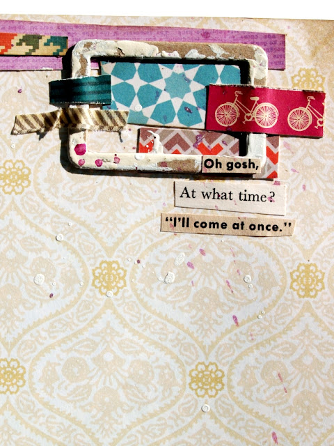
Now here's the page I made to record it:
The journaling is written on some office supply labels while the titling is a combination of October Afternoon and Making Memories alphas. I bought 4 packs of the same colour of the latter in a cheapy bumper pack from TKMaxx and, rather than have 400 identical pink letters to use up, I've coloured over some of them with ProMarkers to match my page:
For a little embellishment cluster at the top I used a chipboard frame from a Collections Elements micro-book [listed below] and a strip of purple paper to balance out the similar strip at the bottom of the page. It also co-ordinated with the purple Shimmerz inks I sprinkled across the page, especially around the chipboard stars:All of the illustrations plus the snippets of wording were taken from a vintage comic book story ... which possibly wasn't originally about a shop which supplied newsboys ... but hey that's what 'artistic licence' was invented for:
The chevron design fabric strips are Studio Calico 'FabRips' which are quite expensive ... for an embellishment [IMO] but I love them, so I treated myself. I used every last tiny scrap of the last packet I had and imagine I'll be doing the same with this one too!
Appropriately enough, due to the newspaper theme of the photos, the Chinese text I used on the stars and tucked down at the was torn from a free Chinese newspaper I spotted on a stand at work which I walked past one morning. It was on my mind all day, so I made sure that, before I left - and when I had a bag with me - I'd return to collect one. First I had a quick scan around to check no one was looking, then I swiped one and stuffed it into my bag in one swift movement.
Considering they were free papers I don't know what I was worried about ... possibly a fear of being questioned about whether or not I could read Chinese! Which of course I can't! And really, I didn't feel like explaining to someone that I didn't want to read it ... I just wanted to use it in my crafting because ... y'know ... it like .. looked sort of ... cool ....?
Because I don't think they'd have understood. But you do ... don't you?
Thanks for reading here today.
Julie :-)
-----------------------------------------
Here are the 3DJean supplies I used on this page:


I love that photo and how you've scrapped it, the cartoons are just perfect.
ReplyDeleteI've been inspired by your purple phase and have blogged about a very purple christmas card I couldn't resist making.
Love your page... can u send me an invite to link manager?? to bonnieangel1797@gmail.com ?? thks
ReplyDeleteThese old signs are great and your layout to document it is just fab Julie, your little quotes are perfect lol! XX
ReplyDeleteBrilliantly amusing page! I really like the way you can just find perfect illustrations for your photos. :)
ReplyDeleteThank you for the smiles and for this rocking page! That's the first word that came to my mind: rocking! You have such an interesting mix of things on there!
ReplyDeleteTotally! I mean understanding the issues with the Chinese newspaper! =)
ReplyDeleteLove all the layering in your page!
This is just fantastic. I love your mix of things on the page and the photo is hilarious!
ReplyDeleteHa ha, what a great sign.
ReplyDeleteAnd a great page to go with it, especially all the piled up paper strips. x
Absolutely love this page and I read the sign in exactly the same way.
ReplyDelete:-) I understand!!! Both the looking around and why you took the chinese paper. Funny picture and beautiful page.
ReplyDelete