
In the first post in this series I shared a list of some of the practical supplies you might need if, like I've done, you were planning to alter an old book and fill its pages with collages. Now today I'd like to add to that by suggesting there's something else you might also need to find before you begin; only this time it's not something as concrete as those items on the list ...

**You're going to need a theme... and a purpose.**
The PURPOSE...
- This aspect of the project is all in your mind!
- It's is the thing that's going to persuade you to get out those supplies, to make the effort, to see the project through.
- It'll be what will keep at bay the guilt of "why am I sitting here cutting up paper when there's an ironing pile in danger of creating a landslide in the corner?"
- It's the thing that can give a shape to how you think about the project.
- For example "I'm making this to ... have a beautiful place to use up my favourite supplies" / "I'm making this to ... document this time in my life" / "I'm making this to ... store all my favourite song lyrics" etc etc - whatever it is that means something to you right now.
- My own purpose was to create a book to be home to 30 collages documenting my Learn Something New Everyday lessons during September 2014. This was ideal for me as it had both a clear purpose ... and a clear end date [it helps to know the project is going to be completed!].
In fact, I only tend to apply such clear boundaries when I 'm working on such a narrow project like this one. It's not how I approach my general messy art-journal and collage fun, the stuff I dip in and out of whenever the mood strikes.
And maybe if you're just going to try out making an altered book, or a collage, for the first time, you might prefer to have no expectations and simply play and experiment at first. But equally ... a bit of structure and purpose might help there too!
And so ...
The THEME ...
- This is what will inform the style of papers you choose, your colour-scheme, your imagery etc
- It's what will help to narrow down your choices from all the papers in the world!
- It can be linked to your purpose ... eg. if you're making a book about travel then your papers / ephemera might be travel themed too / maps / tickets etc.
- Or .. it might have nothing whatsoever to with your purpose ... it can just be a colour-scheme you choose, a set of papers you want to work with, a method you want to try out.
** BTW: if you need any help sourcing imagery or text to fit your chosen theme - drop me a line either by email [link in sidebar] or via an Etsy convo - and together we can curate a bespoke pack of Plundered Pages and/or Ephemera bits to suit! [Whatever the theme is ... I like a challenge ... ]
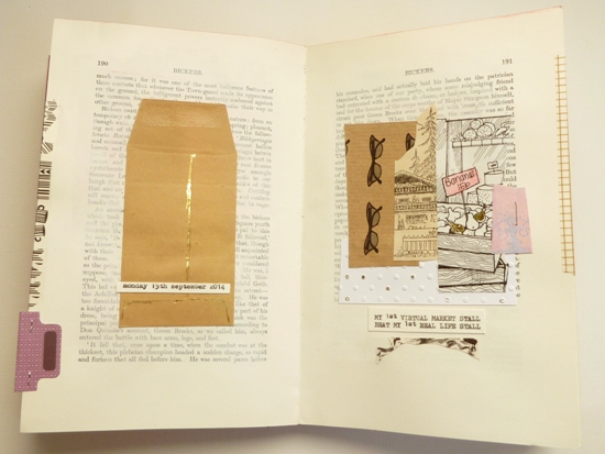
OK, enough explanations ... let me illustrate. My purpose was to create a cohesive book in which to keep my daily lessons meanwhile my theme was inspired by the Wes Anderson film 'The Grand Budapest Hotel'.
Why? Well initially it was because my base book was bright red with gilded lettering ...

... until I remembered how much I loved the look of 'The Grand Budapest Hotel' which features the same gold and lipstick red that I was struggling with but in a most perfectly striking combination with icing sugar pinks, Imperial purple and snowy white:

And suddenly, by 'borrowing' from Anderson's greatness I had myself a colour-palette to work from!

... selecting supplies with a clear theme and/or colour-palette from the start can actually save you time later on:
- Once you have a particular colour combination in mind you can sift and sort through your collection of pages and decorative papers looking purely for colours that matched and even images that fit in.
- You give yourself a clear guide on what to select and - equally importantly - what to leave out.
- It removes all the pressure of decision making / paper shuffling that can slow a project down.
- It releases you from the tyranny of choice! Too much freedom can be harder to deal with than too many restrictions!
- When you get stuck for what to do, or are tempted to just stop, having some clear parameters in place means you can turn to them for inspiration. [You just make another page using the same colours / imagery / theme ... and your creativity gets flowing again.]
- In basing my scheme on The Grand Budapest Hotel I collected together papers in shades of purple, pink, white, red and neutral.
- I painted my pages with a base layer of acrylic paint in various shades of 'icing sugar' pink and cream.
- I also used envelopes [to store my hidden journaling] in matching shades.

As well as taking inspiration from the colours of the film I was also drawn to using imagery of impressive buildings too as seen here on Day 3:

The lesson from this page notes that: 'There are people who will sell you a rainbow' after I passed an Estate Agent's window and noticed they were selling one house using a photo - not of the house itself - but of the view from its windows: the view of a beautiful rainbow over the beach!! As if the rainbow was part of the deal!


While Day 15 borrows dusty whites and pale pink [with a mountainside chalet thrown in!]:

And my final example for today is another which gives a nod to the soft pastel shades and vintage European style of the film:
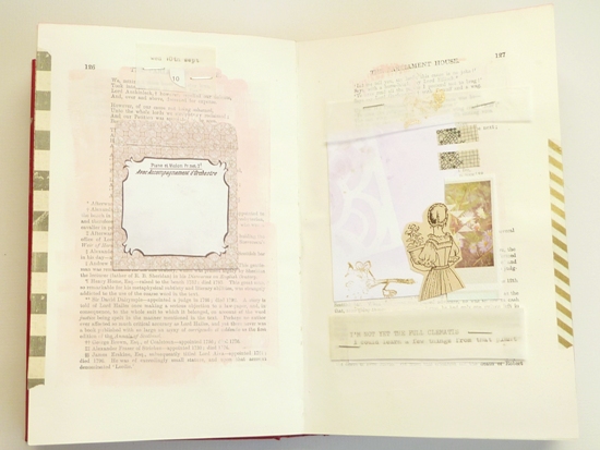
Day 10 'I'm not quite the full clematis':

Now then ... I'm not trying to suggest that anyone who didn't know that I'd based my book on the Grand Budapest scheme could have guessed at the fact simply by looking at the finished pieces ... but that wasn't the point.
Having my theme / colour-scheme:
- set me up at the start
- helped me select my supplies
- inspired my page designs
- and kept me on track while I made 30 of them!
So, once you've collected together those practical supplies take a little time to pull together the creative essentials too.
- decide your purpose for making the book ['to enjoy the process' / 'to cut up nice paper' is reason enough!]
- then set about curating your supplies based around a theme or colour-scheme
[For the record: I've got no idea if geese actually do appreciate your inner confidence; it would be nice to think they do appreciate creative boldness... but let's not take any chances people. I won't be held responsible ... ].
-----------------------------------------------------
What to do once you've chosen your supplies:
- Keep them all together in a bag or box of their own.
- Then, each time you come to work on the project, you know you're only going to be using what's inside.
- This cuts down on your pondering and new supply-seeking time ... which can totally distract you from simply getting on with the 'doing'! [Ask me how I know ...]
- A simple thing like restricting your supplies to those you set out at the start both gives you more time to create but also more focus on using them creatively.
And to keep track of all the posts in the 'Fortune & Geese Favour the Bold' series then you can follow [or simply visit] the Pinterest board I've made for the series here.
-----------------------------------------------------
... you need to find a purpose, a theme/colour-scheme and a bag to throw them all into! So I'll leave you to it.
See you soon.
Julie :-)


Hello Julie, I thought I might make the book/journal to use for my version of JYC or December days. Collecting the bits should be easy as i keep everything...but the cover is blue! More thinking required...
ReplyDeleteDepending on the shade of blue ... how about a Frosty Christmas with blue, silver and white? Or a clean lined Scandinavian style - with red + natural? Or a cosy 'Gentleman's Club' type feel - with tweeds, checks, gold, and burgundy?
DeleteLooking forward to seeing your project!
This is so inspirational! Thanks. I think I'll take a novel too as my theme. Michel Faber's The crimson petal and the white. I loved that book and recently saw the BBC series. London is one of my favorite cities. So now off collecting materials.
ReplyDeleteYour method of working is very helpful and interesting Julie,thankyou. I have a beautiful little book that has been sat on a shelf quite a while waiting to be "altered", I think that time is now! just need to think on my theme and colours a bit more then I can start gathering!!
ReplyDeleteFor a change I am one step ahead - I had already decided that I was doing this for my JYC this year and yay I already have two of your Christmas packs already sat there waiting to be used - of course I will have a little rummage through my Christmas supplies to add in other stuff that I think will come in handy. And I have just ordered a large rotary alphabet stamp to keep all the wording consistent through the album. I will just go off and polish my halo now before it slips and chokes me LOL!!
ReplyDeleteVery organised! And I love my rotary stamp - if it's anything like mine watch out for spelling out and then stamping the word backwards!! Sometimes I get it entirely back to front and upside down! [But, of course, that could just be me .... ] ;-)
DeleteReady and waiting for the papery "feast" to begin.... Think I have oodles of supplies gathered..... no shortage of paper here LOL Thank you in advance for this project
ReplyDeleteThis is such a useful post - I like the definitions of the why and the how. Brain cells churning ... Greens and reds leave me visually exhausted so I might go all faded and sepia this year. Or even black and white. That'll make the photo-to-paper matching easier :).
ReplyDelete