Thursday 29 September 2011

An Art Journal Page: from start to finish

Hi, hi, hi.

Well, it turned out that some of you were indeed interested in me posting a tutorial on the kind of pages I've been making in my Learn Something New Every Day journal. Which was nice, because really, you could have just shrugged saying "Meh. Whatever." when I put the idea out there!

So, for those of you who'd like to see how this page came into being:

Then this is for you:

I should just maybe say:
  • It's not an in-depth look at art-journaling or scrapping or even LSNED in general;
  • It's just a look at the process behind constructing a page for this particular journal [although seeing as how I'm a bit in love with the style it's going to appear in other journals without a doubt];
  • It's a bit of a photo-heavy post - just so you know.
  • If you'd find it beneficial to scrap lift / journal-lift straight from my page and produce a very similar page of your own - to get you started - feel free - that's what I've made the tutorial for.
Step 1:  Prepare a base layer with mixed papers: 
As I've mentioned several times now, I prepared the first layers of all 30 of my LSNED journal pages in advance of getting to the 'interesting' bits.

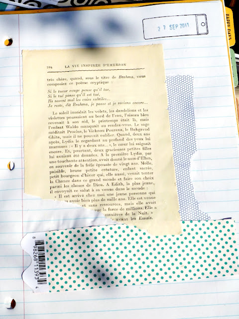
Glue approx. 3 roughly cut or torn sections of paper in a fairly random manner on the page of a notebook.
I used:
  • an old book page;
  • the inside of a security envelope;
  • a scrap of patterned paper;
  • Glued down with Daler Rowney 'Matt Glaze Medium'.
Once I'd done this on all 30 pages, in advance, I knew I had a fighting chance of getting this 'daily' project completed.
  • It meant I could sit in front of the TV, or at the dining table with relatively few supplies at hand, as I already had a workable base. However ...
  • I've also been made aware that this style of working could be useful if you're a crafter with a disability, as it's a way of breaking a page up into manageable chunks.
Thanks so much to the commenter who brought this to my attention as it perfectly draws together my two-strand working life: crafting and working with people with disabilities. I'd be thrilled if this method of working means you feel comfortable making a start, knowing that it can be done in stages as and when you want to or feel able to.

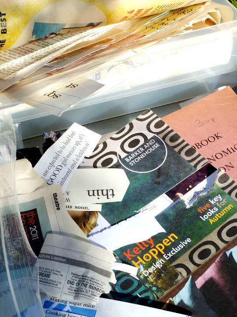
Step 2: Look through magazine clippings, catalogues and ephemera for focal images to suit the theme and feel you'd like the page to have:
Step 3: Select the ones which fit best or which speak to you most.

  • Trim around them and experiment with where they'd work best on the page.
  • Glue them down.
  • [I mostly only ever use a plastic glue-spreader rather than a brush as it means I don't have to have any water handy - I just wipe it with kitchen roll or let the glue dry on and pick it off when it gets too bulky! It saves time and is easier to manage if you're working quickly or on your knee in front of the TV!]
Step 4: Add additional, interesting scraps of paper/labels/ephemera - in colours which match what you've glued down so far:
  • Try overlapping some of your magazine clippings with these new elements;
  • This helps pull everything together, anchoring your images rather than having them floating around.
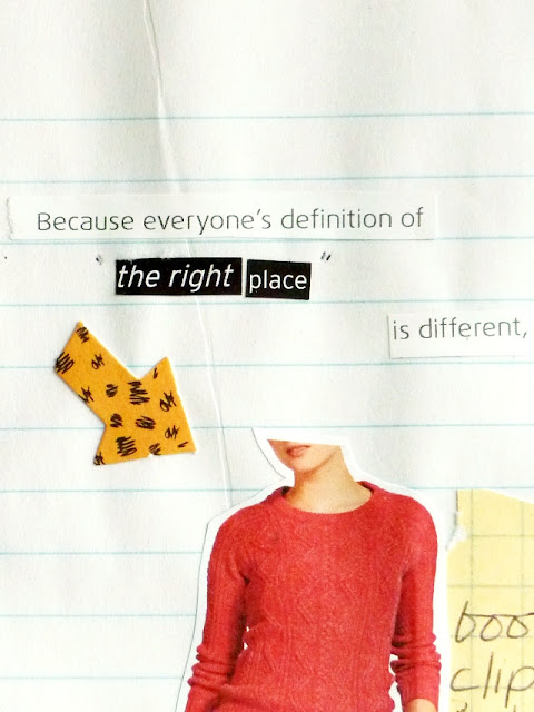
Step 5: Sift through magazines, catalogues, old books etc for wording which suit your theme / feelings / thoughts for the page:
  • Look out for key words or phrases which can help tell your story.
Step 6:  Look for words or phrases you can combine to create your own sentences:
  • Glue them down, again try overlapping existing snippets for a more interesting composition:

Step 7: Cover up some of the text on the old book page with white acrylic paint:

  • Again - due to laziness and impatience - I don't often bother with a paint brush for this type of thing;
  • I use the glue spreader, a scrap of card ... or my fingers.
I also added some streaks of paint at the bottom and along the side.

Step 8: Flick ink at the page!:
  • If you don't want ink on your main images cover them up first;
  • Remove the applicator/pump/dispenser thing from a bottle of spray ink and tap it with your finger to spatter the page;
  • This delivers more individual spots of colour than if you just misted the page in the 'proper' way.
Step 9: When everything's dry add a few more themed words - using stickers:
  • Amongst others, I turn to sheets of 7Gypsies '97% Complete' stickers a lot for journal pages and on cards, layouts ... everything!
Step 10: Doodle around some or all of the words you've added to the page: 
  • This can help to incorporate it into the overall page - rather than have things dotted around;
  • Actually 'doodling' is probably a kind word for what it is I do. Let's just call a spade a spade and say it's scribbling with gel pens:

Step 11: Add the 'journaling' part of the 'art-journaling': 
  • You don't really need any fancy pens or supplies for this;
  • I run strips of cheap Correction Tape across the page [an idea I saw somewhere!] and write on them with a black Biro.
And that's it! A completed page:

I hope you've found something useful or interesting here, if there's anything else you'd like me to ramble on about ... just let me know.

And if you use it to help you create a page of your own ... let me know about that too ... and I'll pop by and grin at you!

Edited to add: As this post contines to be so popular, I've now blogged 'An Art Journal Page: from start-to-finish No.2' which you can read here.

AND:

I have published a book of my 'Snipped Tales' - the tiny snipped text collages as seen on this page - it's available through my Etsy shop - alongside lots of paper kits perfect for mixed media work. 

See you soon.

Julie :-D

-------------------------------------

Wednesday 28 September 2011

Purple Phase: Purple papers with kraft tag + string

Hi, hi.

Since I started 'Purple Phase' I've been intrigued at how many people have 'outed' themselves to me as Purple-fanciers!

Here was me thinking it was the unloved colour of the spectrum when you're all secretly harbouring passions for plum after all! Or are you just like I was, where I'd somehow been oblivious to the extent of my use of purple until one day the evidence was too great and I realised: 'Oh, I guess I quite like purple ... who knew?'.

Well, whether you're a life-long purple-lover, if it's a recent revelation to you, or even if it remains your least favourite colour ... I hope there's something in today's project which you can take and adapt for yourself. 

I talked about purple tones working well with natural and neutral products in previous posts already but I think it's going to be a recurring theme throughout the series. So with that in mind, here's today's palette:
And here's where the scheme came from:

The deep, muted shades on the backing paper make this a card easily suited to send to a man [At least I hope so ... because I did send it to one!].  Also:
  • It's another example of using purple where you might have reached for brown;
  • It lifts the colour-scheme where brown could have become 'muddy';
  • The purple combines with the neutral shades while retaining an element of colour on the project;
  • In this context the plum-coloured velvet ribbon adds a luxurious touch without appearing feminine;
  • It adds a smart backdrop for the kraft card tag:
When trying out this particular combination of colours and textures, think along the lines of:
  • the sumptuous decor of  'Gentlemen's club' lounges - complete with their velvet smoking jackets, leather armchairs, bold wallpaper designs and wooden furniture;
  • Or think of faded signs and the peeling painted wood of an old allotment;
  • Or think of the shades found on heather-covered moors in Autumn;

Rather than the pretty ribbons and bows I might add to a feminine card my finishing touch here was a more masculine equivalent:
  • a knot tied in a length of fine natural coloured button-twine combined with a length of faux-leather thonging  - in plum.

Supplies used:
- Kraft tag and 'Happy Birthday' stamp: Papermania
- Papers: by Onirie, 4Heures37, Cosmo Cricket, LilyBee Designs
- Faux-leather thonging: from The Works craft section
- Button twine: The Ribbon Girl

-------------------------------------
So purple ... on a man's card ... what do you think? Would you try it?

Any thoughts on how else you might use today's palette? [Remember you can pin it to Pinterest or add it to your Favourites if you'd like to keep it safe for future reference.] 

If you have any other occasions or situations in mind for this scheme you're welcome to share your ideas in the comments.

I'll be back later this week with ... I'm not sure what ... maybe more LSNED journal pages ... or more purple-ness ... or .. it's ages since I scrapbooked a page for myself so maybe I feel a layout coming on.

Soon then.

J

Monday 26 September 2011

Journal: LSNED Days 18-23

Hola.

How is / was your Monday? I managed to finish off a mini-book for Papercraft Inspirations, conquer the camera-timer so I could take outfit photos of myself and make a rather tasty chilli-con-carne using homegrown tomatoes ... so I'm calling that A Good Day.

I do have more Purple Phase posts to come this week but I thought I'd get as up-to-date as I can with my Learn Something New Every Day pages.  I really appreciate the great feedback you've been leaving for me about them ... thank you. Some of the comments have made me consider making a some sort of tutorial / step-by-step type thing in a similar style ... so if that's something you'd like to see, just let me know.

Here we go then ...

Sept 18: 'Captured'
While giving the sofa its annual [if it's lucky] cleaning and vacuuming pampering-session I turned around to be greeted by a lens:

Sept 19: 'Breathe ... and try again .. and again.'

Sept 20: 'Signature Style'
When Shimelle's prompt mentioned thinking about our signature style there were certain things which leaped to mind immediately. I'm sure there are others ... but I put down the most obvious. I find it both strange and reassuring to realise that I do have an identifiable 'me' style.

Sept 21: 'Matters'
If I'm going to have to suffer Death-by-Powerpoint all day ... telling me what I do at work matters is a good way to start the day!
Sept 22: 'Speaking Up'
So, I spoke up and it was fine. But I wanted to say SO much more. [It's probably best I didn't though ... for now.]

I don't know where 'Mr. Smith' comes into this .. but this snippet fits the theme and made me smile!

Sept 23: 'Books lovely books'
Unlike the model I used on this page, I didn't actually wear a leather mini-skirt and caress the bookshelves in the Helmsley bookshop ... else I might not have come away with quite as many bargains as I did.

I might have been politely escorted out instead!

Thanks for dropping in today. I'll see you very soon with an Purple Phase post.

Julie :-)

Saturday 24 September 2011

Journal: LSNED Days 12-17

Hi, hi, hi.

I've found a way to make the 'every day' part of Shimelle's Learn Something New Every Day class work for me ... I don't do it everyday ...

I do make sure to think of that day's lesson on the day, but I save up a week's worth of committing it to paper for the weekend. These next pages have been completed for a week but I just haven't had time to photograph them before today.

Any day now you should expect my annual "Where's all the daylight gone? How am I meant to take photos now?" complaint mode to kick in! It's like I can either go out to work during the day OR I can stay home and make use of those precious daylight hours to photograph all my projects ... but I can't do both!  ;-)

Anywhoooo ... here's the pages I have managed to photograph in the light! There'll be more to come whenever the sun comes back out.

Sept 12: 'My Summer-time Life'

Sept 13: 'Just Ask'

Sept 14: 'Let's Share Toys'
I'm really enjoying creating focal points from the images I'd cut from fashion magazines long before this project, it's definitely helped me keep on track with LSNED. I think if I'd decided to take - and more importantly print off - a new photo each day ... it just wouldn't have got done.

Hey - alongside each day's lesson, maybe I've also learned how this style of art-journal-ish scrappiness really suits my haphazard nature! Do you think I can get extra credit for that homework?

Along with the fashion image this page also features an illustration from my current favourite 'retro kid's book to chop up and stick down' ... of which I have several:

Sept 15: 'Maybe ... September's not so bad.'
When I first decided to take this class it was, in part, to distract me from how much September generally annoys me. But now I'm thinking ... maybe that's not so true any more ... maybe ...

Sept 16: 'Just not for me'
I've never had a job which required me to stay in one place - in fact I rarely spend a day in one building, but one or twice a year I help out with the selection process for the new intake to my current job. Which means I have a room to myself ... and paperwork ... and official 'things' to do.

I love parts of it [ie: the clipboard, putting nervous hopefuls at ease, setting out paper and highlighter pens on desks ...]. But the same four walls? Not for me.
My highlight of the day came while showing one young eager man the way out after the test and his parting words to me were: 'Thank you for having me'.

And suddenly I felt like the host of a children's party!

Sept 17: 'At least we don't spoil two homes'
In one small seaside town we managed to browse around:
  • a secondhand bookshop;
  • a charity shop;
  • an auction room;
  • a vintage shop;
  • a vintage market and
  • 2 church bazaars [where we bought cakes and jam - how stereotypically British was that?!]
Right, I'm going to stop now, so I can get on with completing my LSNED pages for this week.

I'll see you very soon.

Julie :-)

Friday 23 September 2011

It's A Sign: Happy Scrapping

Hi, hi.

Taken on a phone camera from a car window I accept that this isn't the best photo of a sign I've ever taken ... but I love it.

On first glance it's just a promotional banner for a garage - it was a part of the trading-in scheme a couple of years ago which was meant to encourage people to buy new cars for the sake of the economy. So far, so mundane.

But look at that hidden message at the top there:

Happy Scrapping!!

How very nice of the Skoda garage, in the midst of an economic slowdown, to wish me well in my hobby!

Happy 'insert your own hobby here' to you today.

Julie :-)

Wednesday 21 September 2011

Purple Phase, colour palette 2: With tan + charcoal

Hi, hi.

Thanks for your feedback on the first 'Purple Phase' colour palette I really do hope you'll find them useful in some way.

Throughout the series the colour combinations I'm going to be suggesting will be illustrated with an example from 'real life' ie:
  • something I already wear;
  • a completed card or scrapbook page;
  • a  mix of colours on something I've bought / use / wear.
This way, I feel like I'll actually be sharing sharing something workable, wearable, liveable etc with you. [And to hopefully prove I'm not just talking out of my hat ... because clearly that would have to be a purple hat ... and I don't have one of those.]

I was reassured to read that the first palette Using Purple with Brown + Tan was received well so ... I'm going to try to build on that today with something which is both similar in colourway and also similar in it's non-threatening use of purple. If we were in school this would be your 'consolidation' lesson!

Here's palette 2:
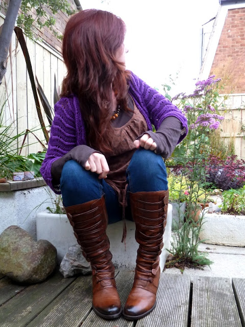
This variation uses a deeper shade than the chalky lavender of last time but I wanted to show how brown and grey can work just as well with a more purple shade of purple!
I used the mid tan colour, the charcoal T-shirt and the wooden beads to help soften and warm up what can be a harsh colour. And here's where the denim comes into it:
I think even though they're quite a bright blue, because they're jeans it's less of a clash and perhaps an easy way-in to wearing purple.
This particular shade is often used for 'dressy' occassions [in fact I bought the cardigan to wear for a party] but I think this colourway shows it can be made to work with a more casual, everyday style.
Cardigan: Dorothy Perkins // Jeans: Gap // Boots: by Bertie // Tunic: TopShop // T-shirt: AllSaints

Now, to make this combination translate across to crafty projects, you could consider using any 'difficult' deep purples with:
  • kraft cardstock;
  • kraft tags;
  • woodgrain papers and embellishments;
  • denim-effect papers and embellishments;
  • grey patterned papers and
  • metal embellishments.
And if you do - I'd love to see it!

------------------------------------------------------------------
There's now a 'Purple Phase' Pinterest board where I'll be pinning:
  • all of the colour palettes I've created;
  • my new projects created for this series;
  • examples of inspiring uses of purple I've found around the internet;
And also,
  • projects created and blogged by you;
  • outfits pulled together / worn and blogged by you;
These can be in response to any of the specific palettes or any of the Purple Phase posts in general. Please bear in mind:
  • You must let me know / leave me a comment that you've blogged it;
  • You must have mentioned Purple Phase in your post with a link to my blog.
  • I'm going to be busy in the next few weeks ... so don't be offended if it takes me a while to get round to pinning them.
OK then,  I'll be back soon with a card which may or may not involve purple ... [OK, I confess, it does involve purple ... but I bet you'd already guessed that!]

See you then then.

Julie

p.s: [and this has nothing to do with purple] if you like the look of the new BBC3 series The Fades please remember to watch it - it starts tonight! It's written by a friend of mine and I'd love it to be a great success for him.

Tuesday 20 September 2011

Pass the Book: the book is on it's way to ...

Hi, hi.

Just a quickie to announce who Sian's 'Pass the Book' book 'Art Saves' will be being passed on to this month.


I let a Random Number Generator choose and it picked No.5 - who is Bernice!

Congratulations Bernice, clearly your question about where I would post to brought you luck. If you email me your address [there's a link in my righthand sidebar] I'll get it in the post to you ASAP.

Thanks to everyone who left a comment for this and don't forget ...
  • if you'd like to be in with another chance of reading it, just keep an eye on Bernice's blog for when she passes the book again!
Julie :-)

Monday 19 September 2011

Purple Phase colour palette 1: With brown + tan

Hi, hi.

Thanks for all your kind comments on my previous post about me missing-out on the Basic Grey Design Team. Thank You so much. You're lovely! Did you know that? Because you are.

Now, before you catch me blushing, let's get started with the first 'proper' post in my Autumn series 'Purple Phase'.

Between now and the end of November I'll be posting several colour schemes for you to take inspiration from, combinations which you could refer to:
  • when putting an outfit together;
  • when creating a card / layout etc;
  • before adding paints + inks to a journal page;
  • when creating a mood board for a room you're re-decorating;
  • as part of a colour inspiration journal;
Or you could simply:
  • Pin the image of the colour-palette to one of your own Pinterest boards for future reference. 
Whatever works for you. [And if you do use the colours at any time - make sure to let me know, I'd love to see.]

Speaking of Pinterest, I've created a Purple Phase board on to which I've already started pinning inspiring purple images and projects, as there's far more purple-inspiration out there than I can manage to blog. Feel free to follow the board or, if you're not on Pinterest, you can simply save the web address: http://pinterest.com/notesonpaper/purple-phase/ and check-in on it every now and again or when you need inspiration.

OK, let's get on with the first colour combination, this one's all about:
I'm currently loving this colourway.
  •  Partly because I feel it will extend the life of my cotton Summer dress right into Autumn and Winter;
  • and partly because purple works so well with natural earthy shades and textures - something I'll be returning to again and again across this series.
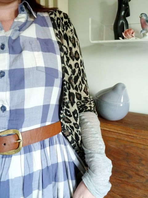
I'd bet that when people say purple is hard to use, they're thinking of a vivid, deep almost synthetic feeling shade. But purple has a vast spectrum and can often be used with or instead of easy-to-use neutrals such as grey and brown:

But you don't have to mix gingham with brown leopard print to use this combination, you could try:
  • A lilac vest poking poking out beneath a brown jumper / cardigan;
  • A chalky purple bag or scarf over a camel winter coat;
  • A soft purple cardigan over a grey t-shirt, jeans and tan leather belt and boots.
Try asking yourself 'Where do I already use grey and brown?' and then, next time, try swapping-out one of those items for something in a shade of purple instead.

Here's the whole outfit [from last Saturday afternoon on a bracing pier overlooking the North Sea]which features additional brown + tan elements:
Dress: Matalan :: Boots: by Bertie :: Tapestry bag: Primark :: Liberty Print Jacket: Jack Wills :: Cardigan: TopShop.

This colour scheme would work equally well on craft projects and for interiors ... just think:
  • chalky blue shades of purple
  • plus
  • natural elements such as twine, cork, leather, rattan, canvas etc etc
... and you've got it!

--------------------------------------------
I'd really like to hear your thoughts on this first post of Purple Phase.
  • Do you think the colour palettes will come in useful? 
  • Do you think you'll try them out?
  • Is today's particular combination , with brown and tan, easier to work with than you'd imagined when you've thought about using 'purple'?
  • And if you do like it - don't forget to pin it to Pinterest or save the web adress of this page so you can refer back to it at some point.
Whatever you think, let me know. Thanks in advance!

Julie :-)