Saturday, 31 January 2015

My Month in Numbers 2015: January


Hello, hello and welcome to the first 'Month in Numbers' of 2015!

Unbelievably this is the start of my 6th year ... and the 61st time I'll have shared my vital monthly statistics!

But, if you're new to this numbery way of doing things then stick around and don't panic ... there's absolutely no long division involved and algebra doesn't even get a look in. And there's plenty of help and inspiration available for any numerical newbies:
  • read the Month in Numbers tutorial I created - it's full of ideas on how and why you might find this a fun thing to do!
  • read a few of my old Month in Numbers posts - you'll quickly see that there's no one single way to do it, no one type of thing to document .... absolutely anything goes!
  • read through posts by the other members of the Month in Numbers community - to do this just visit the  Month in Numbers Pinterest board where I store everyone's contributions, then click through the various images to be directed back to the original posts. There are as many different approaches to it as their are people playing along ... and your unique contribution will be just as welcome!
You'll soon see that it's not really about the numbers at all ... they're just a foundation, a hook, a way-in to documenting those moments that count! It's a great way to keep track of your year ... and to meet new people from around the world along the way.

And, like I say ... it's not all about counting .. because sometimes you can't ...

Countless = the number of times this month I've heard people say they hate January.
  • They say this as they're taking down the Christmas decorations.
  • They say it as they prepare to put down the chocolates and the remote control that have been glued to their hand for the previous fortnight and head back to the world of work.
  • They say it during a snowstorm in the 5 minutes of daylight we get during these post-festive days.
  • They say 'I wish I could go to sleep and wake up in the spring'.
  • They say 'nothing ever happens.' ...
... and it's at that point that I have to call time-out!!!!

Every time = how often that - after someone says 'Nothing happens in January" - I want to reply [maybe while stamping my foot a little]: "What about my birthday?!"
And, as many of you will know, when you have a birthday during one of the darkest, coldest, most deflated months of the year you really do have to hold on to all the festive feeling you can and enjoy your birthday month ... even if no one else does.

And you have to be one of the few people who's left the sanctuary of their cosy home on a snowy day to go somewhere lovely for lunch. [Top tip: January afternoons aren't exactly packed out!]

3 courses = the meal I enjoyed at the restaurant I've visited on my birthday for 2 years in a row. 
Robineau Patisserie [nr Darlington / N.E England] is absolutely my favourite place to eat. Not only is the food completely amazing ... it's only open during the day [apart from the occasional theme night] and, as I'm really not a night bird ... a visit there makes for a lovely long relaxed afternoon eating and talking ... and eating. Then we can go home and get cosy in front of the TV on the evening. A party girl I'm not. But I do like my food ...
It was during the dessert that I reverted to childhood and actually let out a small, deliriously contented, 'Mmmmmm' sound or two at the taste of the warm caramel sauce. I'm not even ashamed to admit that I then used my spoon to scrape out every last drop of it from its chic little jug.

I did some party-hosting of my own this month [again, yes, on an afternoon] where this was my table ...

30 = sheets of paper to make a table-runner
I saw the general idea on Pinterest ages ago and, as goodness knows I have plenty of old books to tear pages from, I decided to take that from inspiration into reality.
 I also made napkin rings from paper too:
They were all pages from dictionaries and encyclopaedias because I thought they'd be a safe option. No one wants to be put off their side salad by a racy scene from a Mills & Boon.. Do they?

Someone did, however, find a diagram of the intestines on their napkin ring ... but that merely seemed an appropriate thing to contemplate when sitting down for a meal ...

8 = the number of days after 'real' Christmas that my friends and I celebrated our traditional fake Christmas. [I've written lots more about fake-Christmasses-past here].
And over 3.5 hours, and 3 pizzas, the 8 of us leisurely exchanged 34 sets of gifts.  [Yes, the maths is correct. I think. It's just complicated as 2 of the group had already exchanged gifts as they're mother and daughter. We can't really expect them to forgo 'real' Christmas and wait for the 'fake' one!].

10 shelves / surfaces / drawers = the areas, so far, I've tackled, sifted through and sorted, in what could be the start of some Spring cleaning. [But, hey, let's not go too crazy just yet. I may have peaked already!]

4 = charity bags filled with the results of my January-tidying-spurt.
And of course ... because I've been so organised ... and created some space by getting rid of a load of old tat ... that means I get to go shopping to fill up the gaps. Right?

£1 each = how much I paid for two old flower arranging frogs:
I know I'm way behind the trend on this one ... but I've always loved how they looked when I've seen them on other people's blogs but, until last weekend, I'd never seen one 'in the flesh' before. So when I saw a box of them in a charity shop I had to have some!

And if you're not sure what it was I planned to do with them then this should explain:
They make lovely, vintage-feeling, holders for when I'm photographing my craft projects and shop products.

49p = how much I paid for this splendid stationery set in [a different]charity shop:
Yes, it was originally a freebie cover-gift from Mollie Makes magazine ... but it worth the price for the black & white stripey washi tape + twine alone! And, of course, as if a sub-50p washi tape wasn't exciting enough, the money goes to charity!

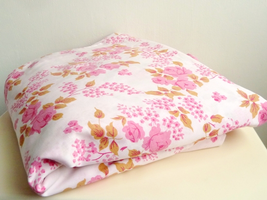
£3.00 = the price of this wonderful vintage duvet cover [from a 3rd charity shop ... my back was aching by the time we got back to the car with this little haul plus the 4 books we bought for 99p!]:
I love old rose prints and I so rarely see nice old bedding in charity shops that I nearly always buy it when I do. This one's in really good condition [nobody wants to find a stain on an old sheet!!] and smell of noting worse than rose scented drawer liners. And while it's not perfect ... it's been altered at some point ... there's even something rather charming about the hand stitching:

4 = the number of books I read. 2 fiction. 2 non-fiction. But I won't go into all the details right now as I'm planning to list them in a new reading-related regular feature I'm planning. I'll try to get that started next week sometime.

1 = how many foxes I spotted, strolling casual-as-you-like along the main road past the steel works.
It was broad daylight, shortly after 10am, and it didn't look anxious or concerned to be out and about and exposed like that. It made me wonder if it had just got off a shift ...

And finally ... if you'll allow me to move seamlessly from a vulpine tale to a lupine one ...

2 = the number of episodes of the BBC's adaptation of Hilary Mantel's Wolf Hall that I've watched ... and revelled in.
If you're a long time Month in Numbers reader then I'll have bored you in 2010 with my progress through the 674 page Wolf Hall novel ... and then again, in 2012 with the 411 page sequel Bring Up the Bodies. And now it's happening all over again with the TV drama! [And after that, at some point, there'll be the final book of Mantel's trilogy ... so don't say you weren't warned!]

I was uncertain about what to expect from the adaptation. For one thing... they've made just 6 hours of drama from over 1000 pages of source material. And for another - I wondered how you could externalise all the necessary action when so much of the feel of the book comes from viewing everything from Thomas Cromwell's perspective; so much so that, while I was reading it I described the feeling as if I was behind his eyes. That I was living there, in Tudor England, rather than just reading about it.

But, fortunately, it's such a sensitive production that they've somehow managed to keep the same atmosphere. Of course there are things missing, time is condensed, events don't unfold quite how they do over the vast expanse of the novel ... but the first episode felt like a visual skim read, a flick-book, a speeded up visual representation of the source material; it may have omitted some of the finer details, but it managed to stay faithful to the essence of the story and characters.

In fact, few minutes into the first episode, when I still didn't know if I was going to love it or not, I turned to James and said 'I hope they do the scenes with the angel wings' [Long story. Literally!]. But really ... what were the chances that - amongst all those scenes, in all those hundreds of pages - they'd have included the fleeting moment that I specifically wanted to see depicted? It was a hope against hope ...

But then ... a few minutes later, Thomas Cromwell's little daughter came into the room wearing her wings made of feathers! And the programme makers found themselves a loyal fan.

--------------------------------------------------

So ... that was my January: a wolf, a fox, 2 frogs, lovely food, good company, new gifts, vintage treasures and some appropriate out with the old ... and in with the new.

Now how about yours? Which statistics shaped your month? The temperature? The depth of the snow? The Christmas decorations you realised where still on display after you thought you'd packed everything away?

As always you're welcome to join me with your own memory keeping-by-numbers.
  • Why not share a few with your blog readers, your Facebook friends, Twitter or Instagram  followers? #Monthinnumbers
  • If your post is 'pin-able' I'll save it to the Month in Numbers board, that way other members of the community can drop by, browse the posts, and then swing by your virtual home for a visit!
  • And don't forget to say hello to me too when you drop back here with your link.
Right I'd better step to one side, that there is the sound of a brand new month eager to get started.

Happy February!

Julie :-)


Thursday, 29 January 2015

'Art is Trash': scrapbooking with collage scraps


Hello you.

Currently one of the most popular items in my Julie Kirk [that's me] Etsy shop are the mini lucky-dip 'Collage Scraps' packs and I want to build on that and explore how there are lots of ways you can put collage scraps to good use ... with collage being only one of them!

For example I've seen/heard examples from customers who've used theirs to decorate journal covers and to cover boxes ... and as for me, I've been busy scrapbooking with mine:
Each 'Collage Scraps' pack consists of different, original scraps and segments from my vintage book and ephemera collection, plus leftovers from my own previous collage/ journal pages and pages of painty experimentations. As such no two packs are the same - so I can't exactly show you the content's of the one you might receive [I pluck them at random] but here are a few recent examples to give you the general idea:
And you can probably tell [because I just can't help myself!!] there's a slight colour-theme within each one which means that you can use them straight out-of-the-packet to create a cohesive, coordinated project without any fuss.
 
Now then ... to illustrate how you can put small scraps such as these to good use on a 12x12" layout I've combined lots of them together on this page [which documents a few of the pieces of work that Spanish artist Francisco de Pajaro created around the site of the Festival of Thrift in Darlington 2014]: 
It's rather appropriate - seeing as how I was using scraps and leftovers - that Pajaro is known for works which are painted directly on to rubbish and items discarded in the street!

And, in case you thought I was being harsh titling my layout 'Art is Trash' ...
... then have no fear ... that's actually the slogan he uses!
In making art from my own 'trash' I simply selected pieces which had something in common, colour-wise, with my photographs and spent time arranging them into a satisfying shape on my kraft card backdrop:
It's a fairly gridded design with very little layering ... which is unusual for my scrapbook pages ... but not at all unique on my collage/journal page. I  think perhaps my collage-inspired supplies also had an effect on the scrapbooking style I chose to work in:

I really just focused on shuffling and swapping the pieces around until each one looked like it had always belonged there; as if the space was created purely for it and it alone:
BTW: Until it came to editing the images to blog them I had no idea that a yellow 'r' alphabet sticker had attached itself to that scallop punched semi-circle Viking helmet illustration at the bottom there!![I'd put money on that being the first time - in the history of sentences - anyone's ever said that before!]

But I guess when you're using scraps to document an artist who works with rubbish ... a stray random element is only to be expected!

To save your scrolling finger ... here's the complete page once again:
'Art is Trash' scrapbook page by Julie Kirk
And here's where you can grab your own 'Collage Scraps' pack.

So how about you?
  • How have you used collage scraps [either those from my shop or your own] on something other that a collage?
  • Or have you seen Pajaro's work anywhere? I know he travels the world art-ifying people's trash ... so maybe you too have photographed it or shared it on your blog.
  • Do feel free to share any of your thoughts, ideas and experiences on today's trashy topic!
Soon soon.

Julie

Monday, 26 January 2015

Cardmaking: inspiration for a 'cascade' / 'concertina' / 'foldy-uppy' card ... whatever you want to call it!


Hi, hi.

If you've leafed through the current issue of Papercraft Inspirations Magazine [February 2015 - Issue 135] then you might have seen my 'Concertina Card' master class [which can also be called a 'cascade' card] where I created step-by-step instructions for two different styles of 'foldy-uppy'-type cards.

[It was technical terms like 'foldy-uppy' that got me the job of writing master classes in the first place ... ;-) ]

So today I thought I'd share another card I've made using the same base as the second, more advanced card, in the magazine feature:
If you already have the magazine then consider this additional inspiration for how you can decorate your finished construction. And, if you haven't seen the magazine you can just consider this some card-y eye-candy. Who knows, it might just tempt you to seek out some instructions and give it a go.

There are two key elements of this particular style of cascade / concertina card that make it one to try:

1. Despite it having a striking amount of depth and dimension ...
... it really does fold up flat enough to go into a regular envelope [unless of course you've used deep embellishments. Even then though, it will fit in a large envelope.]

2. It offers you such a larger canvas to really go to town on:
There are at least 7 individual 'faces' you can decorate and that's only the front-facing ones. If you wanted to make this extra, extra, special you could even decorate the reverse sides. In fact .. add in a few photos and this could easily become a lovely mini-album as well as a card!

Decorating all those faces can be a really creative activity ... where you get to use lots of lovely papery layers:
... complimented by interesting embellishments. Remember to only use flat layers on the inner faces, so that the card will still close! Save you're deeper ones for the front:
BTW: If you're drooling over the papers/stickers then the majority of the project was made with the Carta Bella 'Wildflower' range 2013 which was one of my all time favourite ranges. So much so that I bought the whole collection ... and that never happens! I've used it on so many projects .. and think I still have a few precious scraps left!

If you've only ever made regular cards before then maybe it's time you tried something a little different? and while this probably won't become the only style you'll ever make again ... it can be worth it for a special occasion.

[This was the card I made for my Mam's birthday so it was an appropriate time to go that extra crafting-mile!]

So what do you think? Could you be tempted to make your next card a cascade/concertina/foldy-up card?

Do let me know your thoughts here in a comment or via Facebook page where you can also keep up-to-date with Papercraft Inspirations magazine too.

Julie

Friday, 23 January 2015

Adding the Midas touch: Ideas and inspiration for using gilding flakes and foil.

Hello hello.

The other day, in the final post of my 'Fortune & Geese Favour the Bold' series [a free, 7-part, altered book and collage adventure] I mentioned that I'd be rounding off the whole series with something optional ...
http://www.pinterest.com/notesonpaper/altered-book-adventure-fortune-geese-favour-the-bo/

... something that I personally used on my collage pages but which isn't especially necessary to add to yours. Unless of course you're totally into metallics, spangle, bling, glimmer and shine; in which case it's completely essential!!!

And that something is gilding / foiling.

And it's something I've seen cropping up in commercially produced crafting products more and more recently ... I might even stick my crafty neck out [you can gild it while it's sticking out there if you like!] and say gilding is going to be a continuing trend in 2015 ... so if you want to get in with gold crowd ... keep reading!  

Already this year Jennifer Grace has shared her experiences of the Heidi Swapp 'Minc' heat-foiling machine - watch her 'unboxing and first use' video here. And just today I've noticed the Becky Higgins Project Life 'Desktop Edition' features gold foiling too.
 
 But ... let me share with you how I've been using it in a slightly more messy, scrappy, patchy, distressed way:
There's certainly something to be said for and aggrandising your own work with a spot of gold occasionally. And whether or not it's gen-u-ine 22ct gold or not is neither here nor there! It's the thought - and the shine - that counts!

The idea to use gilding in my Fortune & Geese Favour the Bold project came from the spine of the book I altered:
So I thought I'd simply continue the theme inside the book too.

But before we go all-out Midas I just want to make a few things clear:
  1. None of the links in this post are sponsored by a company or retailer. The supplies I mention were sent to me for use in magazine projects while ago, and I've simply been using the leftovers in my own work.
  2. Whenever I work with / think about / catch sight of gilding flakes etc ... I can't help re-stating my awful Shakespearean wordplay about 'Rosencrantz and Gildingflakes' - and in this case 'Gildingfoil'. So ... there. I've said it again!! I can't help myself .. but at least we've got it out of the way early. [It's OK, no one but my sister ever laughs at that and even then she's probably just doing her sibling duty.]
OK then, let's start with Gildenstern gilding flakes ...

Gilding flakes:
Gilding flakes come in pots, in a variety of shades, not just gold, and can be used in combination with any of your existing rubber stamps:
  • Rather than stamping the design with ink you dab your stamp with the special glue that's sold alongside the flakes [available from brands such as Indigo Blu and Cosmic Shimmer] and then stamp the image as normal. [You must wash your stamp straight away though!];
  • You then pick up a few of the flakes and pat them over the glue-stamped area;
  • Next you use your finger tips and the recommended scrubbing sponge to remove the excess and suddenly your stamped design will be revealed in its golden glory!
I found that this method tended to work best when I used stamps with a clear, bold, design; such as the heart shape [above] and the ampersand [below]:

 That said, it is possible to use them with smaller, more detailed designs such as these arrows:
 ... or these rings:

 
And really, the end result does depend on:
  • How sturdy the stamp is: I found that some of my more 'jelly' soft clear acrylic ones tended to 'squish' a little when pressed down ... AND ...
  • How much glue you used: too much will distorting the design while too little will mean the result is patchy. Appropriately enough the answer lies with Goldilocks: your glue needs to be 'just right'! 
Here's an example of the patchy effect .. although I actually don't mind its imperfections - it seems to sit happily with the laid back style of the pages: 
But, if you're not a stamper ... don't let that put you off using gilding flakes:
 
You can use the glue and the flakes without stamps; all it takes is a combination of flakes + glue ... and the glue can be applied to any surface in any way you fancy!
 
Take, for example, this card [made for my original Papercraft Inspirations magazine gilding 'Masterclass' last year] in which I used several different application techniques: 
The 'LOVE' sentiment was a stamp, using the method I described above, but here are a few alternatives:
  1. To gild the small wooden heart [top left] I simply used a sponge to dab glue all over it and added the flakes on top.
  2. The stripe down the edge was made by covering a strip of strong double-sided tape.
  3. For the die-cut cork heart I stencilled the glue through some sequin waste, removed the stencil, and gilded the design beneath [this is definitely something I'm going to try again with all of those masks and stencils I used to use with ink/paint].  
And if that's whetted your appetite for trying out some more 'freestyle' gilded designs then you're probably going to enjoy gilding foils ...

Gilding foil:
Unlike the flakes gilding foils come as a full sheet of gold [and other colours] but, similar to the flakes they are applied to a project using a specialist glue. 
 
In the case of the Tonertex range [which is the brand I have experience of] the glue is delivered via what they call the Write 'n' Rub foiling pen: 
What the pen design means is that you have the complete freedom to foil any design you fancy; you're not limited to which designs of stamp you have in your collection. If you can write, draw or scribble it [ideal for my scrappy-style pages] then you can foil it!

I'll admit that, occasionally, the pen did play tricks on me [glue coming out when I didn't want it to/not coming out when I did] but this may be due to how I'd stored it. And, to be fair, there are tips on how to avoid this on the pen itself plus there's a useful trouble-shooting page on the Tonertex website to deal with this. But that aside ... here's some ideas on how to put it to use ...
  • Once the glue is flowing you can do anything with it. This could be writing out a phrase or key word, drawing around a stencil or free-styling to highlight interesting areas on your page.
  • Here I traced around some cloud outlines on a vintage image:
  • Then leave it to dry when it will turn clear - this doesn't take long at all.
  • Next place the foil sheet over the dried glue and smooth it out with your fingers, pressing down to make sure the foil had made contact with all of the glued areas:
  • Peel off the foil sheet and that's all there is to it! You're golden [and so is your project!]
  • BTW the end result here is only patchy because that's how I wanted it:
Unlike using the gilding flakes [where you need to remove the glue from your stamps] this method of gilding doesn't involve any clean-up afterwards ... which is ideal if you're a lazy crafter like me!

And, because it was so quick and easy, I went on a small gilding spree ...
Here I used the gold lines to connect together elements from two separate images:
 And here to spruce up the stripe on these trousers:
 And I realised that if I didn't make the pen flow fully I could achieve a nice, scratchy effect:
And, finally, for both this post and my 'Fortune & Geese Favour the Bold' project ... I also used the Write 'n' Rub pen to gild my book cover:
I simply ran the pen around the indent which bordered my cover and pressed the foil sheet down into it ... and the end results were pretty close to the original gilding on the spine!
 And there we have it:
http://www.pinterest.com/notesonpaper/altered-book-adventure-fortune-geese-favour-the-bo/
 ------------------------------------------------------------------
 
So, that's my very own book project ... how about yours?
  • Are you plotting to try out any of the ideas in the series?
  • Are you tempted to seek out some new gilding or foiling products OR, better still ...
  • are you tempted to dive into your existing crafty stash to unearth some you already have but haven't used in a while?
As always, you're welcome to send me links to your projects or simply leave a comment here or over on my Facebook page [whichever's easiest] with your ponderings on gilding and foiling.

Seriously ... how could you resist joining in what could be one of the most vital conversations of 2015??!

Julie ;-)

Tuesday, 20 January 2015

Adding words to your pages. Part 7 of the collage adventure 'Fortune & Geese Favour the Bold'

Hello hello.

It seems like [and quite possibly is] an eon since I began this altered book + collage adventure but let's keep moving forward towards our final destination: the finished book!

There's one more optional extra I plan to share later but, as it's not a vital part of making and completing an altered book or a collage, today's post really will round-off the main content of the series.
http://www.pinterest.com/notesonpaper/altered-book-adventure-fortune-geese-favour-the-bo/

I'd like to think that, while it may have taken me a few months to share everything I wanted to share, this can now become a self-contained series of posts for anyone to dip back into either as a full series, a free creative workshop from start to finish or as one-off bite-size inspiration hit at any time in the future. And here's how the full journey unfolds:
  • Part 1: Prep notes and supplies list
  • Part 2: Introducing a themed focus into your altered book / journal
  • Part 3: Turning an old book into a new home for your collage
  • Part 4: 101 alternative crafty supplies ... and where to find them
  • Part 5: Using figures to create a narrative in your collage
  • Part 6: Experimenting with Abstract collage (while playing with your favourite papers)
  • Part 7: [you are here!] Adding words to your pages.

  • And if you've been occasionally joining in the adventure - picking up tips and ideas from along the way - do let me know, it'll be great to see your interpretations. [For example, here's how Alexa at Trimming the Sails recently used the altered book she created to house her December 2014 journal].

    Now let's venture on to the final leg of our journey ...

    Today's examples and ponderings relate to adding words to a collage. Some people might refer to this as adding 'journaling' but if that all feels too grand or too personal ... then 'words' does the job just as well!

    Of course, there's absolutely no reason you need to add words on your pages at all; collage can be, and often is, purely about the images and colours involved. But, for the purposes of this particular project, [my 'Fortune and Geese Favour the Bold' / Learn Something New Everyday journal] I added wording using two different methods:
    1. Longer-form handwritten journaling hidden away in envelopes. And
    2. A shorter typed summary / title.
    Let's take look at both of those first before moving on to various other examples of methods I've used in the past:

    1. Longer-form handwritten journaling hidden away in envelopes.
    http://www.pinterest.com/notesonpaper/altered-book-adventure-fortune-geese-favour-the-bo/
    After reflecting on what 'lesson' I'd learned each day, jotting down notes and ideas throughout the week, I then wrote out longer explanations detailing the story behind them to put things into context. These I wrote out, by hand, into a notebook then tore out the pages and popped them inside the envelopes I'd added to each double-spread page of my book.

    I chose to hide my journaling away more for aesthetic reasons than ones of privacy ... although privacy was a consideration when I knew I'd be sharing my pages online. But really I chose to keep the wording separate mainly as it meant I wouldn't have to write all over the collage I created.

    Writing across the page seems to work better on art-journal pages, where you might have intentionally left room to add in your journaling later, but I wanted the main focus of these pages to remain fairly abstract and more about colour and form rather than spelling out things literally. However ...

    ... as I'm a dyed-in-the-wool word lover I haven't yet weaned myself from using at least a few words on a page! Which is where the next method comes in ...

    2. A shorter typed summary / title.
    The short, pithy, lessons you're encouraged to recognise and document through the 'Learn something New Everyday' project [hosted at shimelle.com] can be nicely presented in this typed format.

    Day 12: It's nice to be reminded that there are people who 'get' me:
    The size of the typed font keeps the phrase small and compact meaning it doesn't take over your entire page; it can easily be slotted in amongst the other collage elements:

    And yet these few lines can remain detailed enough to give a distinct flavour of both the day in which you experienced it and also the theme of the elements on the page. Plus, if you're using an altered book - where you've painted over some, but not all of the text - adding in some additional typing can really reflect the original nature of the book pages.

    Also ... you can't beat the look of typing for adding a nostalgic, slightly edgy, arty kind of style to your altered book especially if your keyboard / typewriter ribbon is as unreliable, imperfect and eccentric as mine! [What's that they say about bad workmen? ... ]:
    You could also use typing to add:
    • a title
    • a list
    • a quotation
    • lyrics

    If you don't have a typewriter you can, of course, write your journaling in a typewriter style of font and print it out but I prefer my typewriter for 2 main reasons:
    1. The first is that it's more immediate, I can have the whole phrase typed out before my laptop's even warmed up ...
    2. and secondly, I can easily type directly on to scraps of old paper, which I love to do:
    In fact, I like it so much ... whenever I cut up an old book [which is fairly often for my shop products!] to use its images or text I save up the blank inside pages and off-cuts to type on later!
     
    Oh yes I do ...
    Who just said 'can't she throw anything away?' ... [BTW: the answer to that - when it comes to papery goodness - is 'No!']
     
    If you're debating with yourself over whether or not to buy a typewriter then this post I wrote last year might help ... I say *might* ... 
    5 things laptop user should take into account when thinking about buying a *typewriter*. [All the stuff you won't (a) find in a manual and (b) to be honest, might not really need to know ...]
    3. Using snippets of words:
    I've written lots more about using snippets of words, cut from old book pages here [complete with examples of my 'Snipped Tales'], and also here.

    However ... this is a page before I added any additional typed journaling but, while I was putting it together a few key words leapt out at me:
    The 'lesson' I was documenting that day related to watching Game of Thrones and the phrases I came across in amongst my collagey bits just seemed to fit! ["The Old Gods and the New"?? Get it?? ...]

    So remember to keep your eyes, and your mind, open when sifting through old book pages etc as a few, well chosen words, can say plenty! You certainly don't need to write out any particular full sentence to take advantage of some nice old fonts on your page.

    For more examples of how to add wording/meaning/context to your projects allow me to take you on a minor detour away from my 'Fortune and Geese Favour the Bold' altered book and on to some alternative routes ...

    Examples from other projects:

    4. Typing in a junk journal:
    All of the journaling in my May 2014 junk journal was typed:
    Again, it's a really useful method of getting lots of details down in a small space, plus ... you can write it all out directly on to various interesting layers [eg. tags, envelopes, tickets, old paper etc].

    Or how about another method that lets you add wording wherever you want it?

    5. Stamping:
    Small alphabet stamps are one of the most useful things you can have in your basic crafty stash! While pre-made commercial sentiment stamps are all well and good ... you can't always expect to find the exact phrase you want! ;-)

    Case in point:
    So yes ... small alpha stamps are a great way to add your own words quickly wherever you want them.

    For these examples, for my 'Learn Something New Everyday' project 2013 I used a roller style of alphabet stamp and a black ink-pad. It's not always a perfect method [although that could be just me! There I go blaming my tools again!] but personally I don't mind the imperfections ... they seem to fit in just fine with my messy, disjointed scrappy collage style:
    [There are lots more links to examples of  my previous collage work on my Pinterest board].
     
    And finally ... how about a mix of styles on one page?
    Back in 2012 my 'Learn Something New Everyday' pages featured a combination of: handwriting, stamped words - using different fonts - and snippets of words cut from books which supported the overall theme:
     
    Well ... with those wordy options we seem to have reached the end of our collage adventure which is appropriate for me really as I still can't consider a page 'finished' until it displays at least one or two words!
     
    I hope it's offered you some alternatives and inspiration to try next time you want to add any kind of journaling, detail, title to your creative journal pages, collage, scrapbook layouts and even tags and cards.
     
    As I've said, I have an extra post still to share but that's just some sparkly eye-candy to enjoy while you catch your breath after the journey! 
     
    
    Here, again, are all the previous posts for easy access: 
  • Part 1: Prep notes and supplies list
  • Part 2: Introducing a themed focus into your altered book / journal
  • Part 3: Turning an old book into a new home for your collage
  • Part 4: 101 alternative crafty supplies ... and where to find them
  • Part 5: Using figures to create a narrative in your collage
  • Part 6: Experimenting with Abstract collage (while playing with your favourite papers)
  • Part 7: [you are here!] Adding words to your pages.

  • Better still ... why not Pin this page to one of your Pinterest boards for future reference?

    ---------------------------------------------
     
    I do hope you've picked up a few ideas. or even a little pocket of collage confidence, somewhere along the path of our 'Fortune & Geese Favour the Bold' journey; it's really what the series was intended for. [Well, that and having an opportunity to share and chat about lovely paper!]
     
    Don't forget to get in touch with any of your projects whenever you begin your own altered book and collage journey, and feel free to share any of your steps along the way.
     
    As always ... thanks for keeping me company on our creative trip ... now I'll have to have a think about where we go to next!
     
    Julie
     
    ---------------------------------------------
    And, if you fancy some collage-supply inspiration then look no further than:
    ... the packs of 'Collage Scraps' you can grab from my shop:
    https://www.etsy.com/uk/listing/209715534/collage-scraps-lucky-dip-pack-of?ref=shop_home_feat_2
    They're absolutely the kind of supplies I use in my own work [naturally ... as they some from my personal book collection and my work desk!] so if the style I've been sharing during this series is something you currently work in, or would like to try out, then these are perfect bundles of fresh scrappy intrigue for you!

    Likewise the good old 'Serendipity Packs' which contain all kinds of snippets and images form old books.

    Or there's the new[ish] 'Fabulous Figures':
    Which are ideal if you like to incorporate people / bodies / characters into your work.