Friday, 23 January 2015

Adding the Midas touch: Ideas and inspiration for using gilding flakes and foil.

Hello hello.

The other day, in the final post of my 'Fortune & Geese Favour the Bold' series [a free, 7-part, altered book and collage adventure] I mentioned that I'd be rounding off the whole series with something optional ...
http://www.pinterest.com/notesonpaper/altered-book-adventure-fortune-geese-favour-the-bo/

... something that I personally used on my collage pages but which isn't especially necessary to add to yours. Unless of course you're totally into metallics, spangle, bling, glimmer and shine; in which case it's completely essential!!!

And that something is gilding / foiling.

And it's something I've seen cropping up in commercially produced crafting products more and more recently ... I might even stick my crafty neck out [you can gild it while it's sticking out there if you like!] and say gilding is going to be a continuing trend in 2015 ... so if you want to get in with gold crowd ... keep reading!  

Already this year Jennifer Grace has shared her experiences of the Heidi Swapp 'Minc' heat-foiling machine - watch her 'unboxing and first use' video here. And just today I've noticed the Becky Higgins Project Life 'Desktop Edition' features gold foiling too.
 
 But ... let me share with you how I've been using it in a slightly more messy, scrappy, patchy, distressed way:
There's certainly something to be said for and aggrandising your own work with a spot of gold occasionally. And whether or not it's gen-u-ine 22ct gold or not is neither here nor there! It's the thought - and the shine - that counts!

The idea to use gilding in my Fortune & Geese Favour the Bold project came from the spine of the book I altered:
So I thought I'd simply continue the theme inside the book too.

But before we go all-out Midas I just want to make a few things clear:
  1. None of the links in this post are sponsored by a company or retailer. The supplies I mention were sent to me for use in magazine projects while ago, and I've simply been using the leftovers in my own work.
  2. Whenever I work with / think about / catch sight of gilding flakes etc ... I can't help re-stating my awful Shakespearean wordplay about 'Rosencrantz and Gildingflakes' - and in this case 'Gildingfoil'. So ... there. I've said it again!! I can't help myself .. but at least we've got it out of the way early. [It's OK, no one but my sister ever laughs at that and even then she's probably just doing her sibling duty.]
OK then, let's start with Gildenstern gilding flakes ...

Gilding flakes:
Gilding flakes come in pots, in a variety of shades, not just gold, and can be used in combination with any of your existing rubber stamps:
  • Rather than stamping the design with ink you dab your stamp with the special glue that's sold alongside the flakes [available from brands such as Indigo Blu and Cosmic Shimmer] and then stamp the image as normal. [You must wash your stamp straight away though!];
  • You then pick up a few of the flakes and pat them over the glue-stamped area;
  • Next you use your finger tips and the recommended scrubbing sponge to remove the excess and suddenly your stamped design will be revealed in its golden glory!
I found that this method tended to work best when I used stamps with a clear, bold, design; such as the heart shape [above] and the ampersand [below]:

 That said, it is possible to use them with smaller, more detailed designs such as these arrows:
 ... or these rings:

 
And really, the end result does depend on:
  • How sturdy the stamp is: I found that some of my more 'jelly' soft clear acrylic ones tended to 'squish' a little when pressed down ... AND ...
  • How much glue you used: too much will distorting the design while too little will mean the result is patchy. Appropriately enough the answer lies with Goldilocks: your glue needs to be 'just right'! 
Here's an example of the patchy effect .. although I actually don't mind its imperfections - it seems to sit happily with the laid back style of the pages: 
But, if you're not a stamper ... don't let that put you off using gilding flakes:
 
You can use the glue and the flakes without stamps; all it takes is a combination of flakes + glue ... and the glue can be applied to any surface in any way you fancy!
 
Take, for example, this card [made for my original Papercraft Inspirations magazine gilding 'Masterclass' last year] in which I used several different application techniques: 
The 'LOVE' sentiment was a stamp, using the method I described above, but here are a few alternatives:
  1. To gild the small wooden heart [top left] I simply used a sponge to dab glue all over it and added the flakes on top.
  2. The stripe down the edge was made by covering a strip of strong double-sided tape.
  3. For the die-cut cork heart I stencilled the glue through some sequin waste, removed the stencil, and gilded the design beneath [this is definitely something I'm going to try again with all of those masks and stencils I used to use with ink/paint].  
And if that's whetted your appetite for trying out some more 'freestyle' gilded designs then you're probably going to enjoy gilding foils ...

Gilding foil:
Unlike the flakes gilding foils come as a full sheet of gold [and other colours] but, similar to the flakes they are applied to a project using a specialist glue. 
 
In the case of the Tonertex range [which is the brand I have experience of] the glue is delivered via what they call the Write 'n' Rub foiling pen: 
What the pen design means is that you have the complete freedom to foil any design you fancy; you're not limited to which designs of stamp you have in your collection. If you can write, draw or scribble it [ideal for my scrappy-style pages] then you can foil it!

I'll admit that, occasionally, the pen did play tricks on me [glue coming out when I didn't want it to/not coming out when I did] but this may be due to how I'd stored it. And, to be fair, there are tips on how to avoid this on the pen itself plus there's a useful trouble-shooting page on the Tonertex website to deal with this. But that aside ... here's some ideas on how to put it to use ...
  • Once the glue is flowing you can do anything with it. This could be writing out a phrase or key word, drawing around a stencil or free-styling to highlight interesting areas on your page.
  • Here I traced around some cloud outlines on a vintage image:
  • Then leave it to dry when it will turn clear - this doesn't take long at all.
  • Next place the foil sheet over the dried glue and smooth it out with your fingers, pressing down to make sure the foil had made contact with all of the glued areas:
  • Peel off the foil sheet and that's all there is to it! You're golden [and so is your project!]
  • BTW the end result here is only patchy because that's how I wanted it:
Unlike using the gilding flakes [where you need to remove the glue from your stamps] this method of gilding doesn't involve any clean-up afterwards ... which is ideal if you're a lazy crafter like me!

And, because it was so quick and easy, I went on a small gilding spree ...
Here I used the gold lines to connect together elements from two separate images:
 And here to spruce up the stripe on these trousers:
 And I realised that if I didn't make the pen flow fully I could achieve a nice, scratchy effect:
And, finally, for both this post and my 'Fortune & Geese Favour the Bold' project ... I also used the Write 'n' Rub pen to gild my book cover:
I simply ran the pen around the indent which bordered my cover and pressed the foil sheet down into it ... and the end results were pretty close to the original gilding on the spine!
 And there we have it:
http://www.pinterest.com/notesonpaper/altered-book-adventure-fortune-geese-favour-the-bo/
 ------------------------------------------------------------------
 
So, that's my very own book project ... how about yours?
  • Are you plotting to try out any of the ideas in the series?
  • Are you tempted to seek out some new gilding or foiling products OR, better still ...
  • are you tempted to dive into your existing crafty stash to unearth some you already have but haven't used in a while?
As always, you're welcome to send me links to your projects or simply leave a comment here or over on my Facebook page [whichever's easiest] with your ponderings on gilding and foiling.

Seriously ... how could you resist joining in what could be one of the most vital conversations of 2015??!

Julie ;-)

Tuesday, 20 January 2015

Adding words to your pages. Part 7 of the collage adventure 'Fortune & Geese Favour the Bold'

Hello hello.

It seems like [and quite possibly is] an eon since I began this altered book + collage adventure but let's keep moving forward towards our final destination: the finished book!

There's one more optional extra I plan to share later but, as it's not a vital part of making and completing an altered book or a collage, today's post really will round-off the main content of the series.
http://www.pinterest.com/notesonpaper/altered-book-adventure-fortune-geese-favour-the-bo/

I'd like to think that, while it may have taken me a few months to share everything I wanted to share, this can now become a self-contained series of posts for anyone to dip back into either as a full series, a free creative workshop from start to finish or as one-off bite-size inspiration hit at any time in the future. And here's how the full journey unfolds:
  • Part 1: Prep notes and supplies list
  • Part 2: Introducing a themed focus into your altered book / journal
  • Part 3: Turning an old book into a new home for your collage
  • Part 4: 101 alternative crafty supplies ... and where to find them
  • Part 5: Using figures to create a narrative in your collage
  • Part 6: Experimenting with Abstract collage (while playing with your favourite papers)
  • Part 7: [you are here!] Adding words to your pages.

  • And if you've been occasionally joining in the adventure - picking up tips and ideas from along the way - do let me know, it'll be great to see your interpretations. [For example, here's how Alexa at Trimming the Sails recently used the altered book she created to house her December 2014 journal].

    Now let's venture on to the final leg of our journey ...

    Today's examples and ponderings relate to adding words to a collage. Some people might refer to this as adding 'journaling' but if that all feels too grand or too personal ... then 'words' does the job just as well!

    Of course, there's absolutely no reason you need to add words on your pages at all; collage can be, and often is, purely about the images and colours involved. But, for the purposes of this particular project, [my 'Fortune and Geese Favour the Bold' / Learn Something New Everyday journal] I added wording using two different methods:
    1. Longer-form handwritten journaling hidden away in envelopes. And
    2. A shorter typed summary / title.
    Let's take look at both of those first before moving on to various other examples of methods I've used in the past:

    1. Longer-form handwritten journaling hidden away in envelopes.
    http://www.pinterest.com/notesonpaper/altered-book-adventure-fortune-geese-favour-the-bo/
    After reflecting on what 'lesson' I'd learned each day, jotting down notes and ideas throughout the week, I then wrote out longer explanations detailing the story behind them to put things into context. These I wrote out, by hand, into a notebook then tore out the pages and popped them inside the envelopes I'd added to each double-spread page of my book.

    I chose to hide my journaling away more for aesthetic reasons than ones of privacy ... although privacy was a consideration when I knew I'd be sharing my pages online. But really I chose to keep the wording separate mainly as it meant I wouldn't have to write all over the collage I created.

    Writing across the page seems to work better on art-journal pages, where you might have intentionally left room to add in your journaling later, but I wanted the main focus of these pages to remain fairly abstract and more about colour and form rather than spelling out things literally. However ...

    ... as I'm a dyed-in-the-wool word lover I haven't yet weaned myself from using at least a few words on a page! Which is where the next method comes in ...

    2. A shorter typed summary / title.
    The short, pithy, lessons you're encouraged to recognise and document through the 'Learn something New Everyday' project [hosted at shimelle.com] can be nicely presented in this typed format.

    Day 12: It's nice to be reminded that there are people who 'get' me:
    The size of the typed font keeps the phrase small and compact meaning it doesn't take over your entire page; it can easily be slotted in amongst the other collage elements:

    And yet these few lines can remain detailed enough to give a distinct flavour of both the day in which you experienced it and also the theme of the elements on the page. Plus, if you're using an altered book - where you've painted over some, but not all of the text - adding in some additional typing can really reflect the original nature of the book pages.

    Also ... you can't beat the look of typing for adding a nostalgic, slightly edgy, arty kind of style to your altered book especially if your keyboard / typewriter ribbon is as unreliable, imperfect and eccentric as mine! [What's that they say about bad workmen? ... ]:
    You could also use typing to add:
    • a title
    • a list
    • a quotation
    • lyrics

    If you don't have a typewriter you can, of course, write your journaling in a typewriter style of font and print it out but I prefer my typewriter for 2 main reasons:
    1. The first is that it's more immediate, I can have the whole phrase typed out before my laptop's even warmed up ...
    2. and secondly, I can easily type directly on to scraps of old paper, which I love to do:
    In fact, I like it so much ... whenever I cut up an old book [which is fairly often for my shop products!] to use its images or text I save up the blank inside pages and off-cuts to type on later!
     
    Oh yes I do ...
    Who just said 'can't she throw anything away?' ... [BTW: the answer to that - when it comes to papery goodness - is 'No!']
     
    If you're debating with yourself over whether or not to buy a typewriter then this post I wrote last year might help ... I say *might* ... 
    5 things laptop user should take into account when thinking about buying a *typewriter*. [All the stuff you won't (a) find in a manual and (b) to be honest, might not really need to know ...]
    3. Using snippets of words:
    I've written lots more about using snippets of words, cut from old book pages here [complete with examples of my 'Snipped Tales'], and also here.

    However ... this is a page before I added any additional typed journaling but, while I was putting it together a few key words leapt out at me:
    The 'lesson' I was documenting that day related to watching Game of Thrones and the phrases I came across in amongst my collagey bits just seemed to fit! ["The Old Gods and the New"?? Get it?? ...]

    So remember to keep your eyes, and your mind, open when sifting through old book pages etc as a few, well chosen words, can say plenty! You certainly don't need to write out any particular full sentence to take advantage of some nice old fonts on your page.

    For more examples of how to add wording/meaning/context to your projects allow me to take you on a minor detour away from my 'Fortune and Geese Favour the Bold' altered book and on to some alternative routes ...

    Examples from other projects:

    4. Typing in a junk journal:
    All of the journaling in my May 2014 junk journal was typed:
    Again, it's a really useful method of getting lots of details down in a small space, plus ... you can write it all out directly on to various interesting layers [eg. tags, envelopes, tickets, old paper etc].

    Or how about another method that lets you add wording wherever you want it?

    5. Stamping:
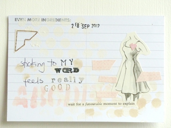
    Small alphabet stamps are one of the most useful things you can have in your basic crafty stash! While pre-made commercial sentiment stamps are all well and good ... you can't always expect to find the exact phrase you want! ;-)

    Case in point:
    So yes ... small alpha stamps are a great way to add your own words quickly wherever you want them.

    For these examples, for my 'Learn Something New Everyday' project 2013 I used a roller style of alphabet stamp and a black ink-pad. It's not always a perfect method [although that could be just me! There I go blaming my tools again!] but personally I don't mind the imperfections ... they seem to fit in just fine with my messy, disjointed scrappy collage style:
    [There are lots more links to examples of  my previous collage work on my Pinterest board].
     
    And finally ... how about a mix of styles on one page?
    Back in 2012 my 'Learn Something New Everyday' pages featured a combination of: handwriting, stamped words - using different fonts - and snippets of words cut from books which supported the overall theme:
     
    Well ... with those wordy options we seem to have reached the end of our collage adventure which is appropriate for me really as I still can't consider a page 'finished' until it displays at least one or two words!
     
    I hope it's offered you some alternatives and inspiration to try next time you want to add any kind of journaling, detail, title to your creative journal pages, collage, scrapbook layouts and even tags and cards.
     
    As I've said, I have an extra post still to share but that's just some sparkly eye-candy to enjoy while you catch your breath after the journey! 
     
    
    Here, again, are all the previous posts for easy access: 
  • Part 1: Prep notes and supplies list
  • Part 2: Introducing a themed focus into your altered book / journal
  • Part 3: Turning an old book into a new home for your collage
  • Part 4: 101 alternative crafty supplies ... and where to find them
  • Part 5: Using figures to create a narrative in your collage
  • Part 6: Experimenting with Abstract collage (while playing with your favourite papers)
  • Part 7: [you are here!] Adding words to your pages.

  • Better still ... why not Pin this page to one of your Pinterest boards for future reference?

    ---------------------------------------------
     
    I do hope you've picked up a few ideas. or even a little pocket of collage confidence, somewhere along the path of our 'Fortune & Geese Favour the Bold' journey; it's really what the series was intended for. [Well, that and having an opportunity to share and chat about lovely paper!]
     
    Don't forget to get in touch with any of your projects whenever you begin your own altered book and collage journey, and feel free to share any of your steps along the way.
     
    As always ... thanks for keeping me company on our creative trip ... now I'll have to have a think about where we go to next!
     
    Julie
     
    ---------------------------------------------
    And, if you fancy some collage-supply inspiration then look no further than:
    ... the packs of 'Collage Scraps' you can grab from my shop:
    https://www.etsy.com/uk/listing/209715534/collage-scraps-lucky-dip-pack-of?ref=shop_home_feat_2
    They're absolutely the kind of supplies I use in my own work [naturally ... as they some from my personal book collection and my work desk!] so if the style I've been sharing during this series is something you currently work in, or would like to try out, then these are perfect bundles of fresh scrappy intrigue for you!

    Likewise the good old 'Serendipity Packs' which contain all kinds of snippets and images form old books.

    Or there's the new[ish] 'Fabulous Figures':
    Which are ideal if you like to incorporate people / bodies / characters into your work.
     

    Thursday, 8 January 2015

    2014: A Year in Bad Portraits


    Hello you.

    So 2015's here [Happy new year!] and there's a lot of 'new year new you' type content doing the rounds online right now.

    And while it may all be appropriate for those out there who are ready for something fresh, who have the energy for making plans and sticking to resolutions ... personally I'm still feeling some festive jet-lag.

    So, just as I did this time last year, rather than share my shiny fresh new goals for a better and brighter me ... which would be both exhausting and quite probably utterly fictional [I have no idea of what my plans for this year are!] I think I know what we'd both prefer I shared right now ...
    • Something to make us both smile.
    • Something to demonstrates not everyone you visit online has it entirely together. Not even close!
    • Something that you can read through while still working your way through the chocolate / alcohol mountain you stocked up on for Christmas ... without feeling any guilt.
    • Something that has the comforting ring of recognition.
    And if all that fails ... hey, you can just revel in the schadenfreude on offer, and have a good old laugh at my expense.  I don't mind ...

    So here we go ...
    I have a feeling that this retrospective of bad photos of me has already becoming A Tradition.

    I blogged 'A Year in Bad Portraits' last January and all throughout 2014, whenever I spotted a horrific image in amongst my snapshots, I dragged it over into a folder reserved just for this occasion; and now here I am, ready to open up that folder to you!

    [BTW: you're welcome to join me ... there are some rules at the bottom if you're feeling brave!]

    I think that during this start of a new year, [which is also my birthday week], it's not a bad idea to look back over the previous 365 days with an honest eye and to move forward with a light heart. In fact, it seems almost as healthy a thing to do as all those detoxes and training plans those energetic people are blogging about!

    So please, settle back with your violet creams and cherry brandy [just me?] and do enjoy this peek into my Bad Portraits file ...

    January 2014: Start as you mean to go on ...
    For the last few years James and I have taken a selfie shortly after midnight when the new year is just minutes old. Maybe in future we'll remember to check that we haven't got the full zoom on:
    So yes, it's imperfect, and James has no eyes and I have no mouth but ... it's like I always end up saying: You don't get a second chance at a first photo.

    [If this photo is familiar it's either because you've spent a lot of time staring at my nose or you saw this scrapbook page I made with it last year.]

    May 2014: Why was there a 10 year old boy on our sofa asking for more wine ... oh , actually ... no, wait ... 
    Yes that is me. On the sofa, in my comfies, with my hood up, wanting a top up of wine in a pose I'm calling: if Oliver Twist was a skater-boy.

    I think it was the shock of the hood, rather than me asking for more wine [he's used to that by now], that caused James to reach for his camera to capture this stunning image. And yes, he did top up my glass, who could refuse that face?

    May 2014: It could just be paper-snipper's cramp ...
    Except ... it wasn't paper-snipper's cramp.

    Back in the spring I was planning a blog post about how I construct my 'Snipped Tales' [short, short, stories / poems made from words snipped from old book pages] and I asked James to take some photos of me at work.

    While I can't exactly recall what James had done to elicit such an ... expressive ... gesture from me I'm guessing this pose is something like: Stop trying to make me laugh because it'll blow all these tiny paper scraps everywhere!
    It's typical that he usually takes forever to line up a shot and take a photo ... yet he managed to capture me mid-offence without any effort!

    June 2014: Taking a moment to commune with nature ... and Bradley Wiggins ...
    A sunny day, shortly after the Grand Depart of the Tour de France 2014 passed through North Yorkshire and I paused in front of an allotment to get a photo of me with a papier-mâché figure of cyclist Bradley Wiggins [on the yellow bike over my shoulder].
    I'm either really feeling the moment ... or else the sun's in my eyes.

    Later that day ...

    Note to self: when attempting to take a selfie while eating an ice-cream ... maybe don't shoot from below:
    Because nothing says 'Great British Summertime' like having ice-cream coming out of your nose ...
     
    July 2014: And I wonder why no one's ever asked me to help them name a clothing range ...
    While this isn't an especially awful photo of me it does give me the opportunity to share with you an item of clothing that I refer to as [look away now if you're of a nervous disposition] my 'condom coat':
    No matter how many nice new clothes I buy for our annual break in Lincoln, no matter how many carefully curated outfits I take with me, there's always a holiday snap of me, at the airshow, either in the rain, or shortly afterwards [it's England. It always rains when it knows you're going to be outside all day] looking damp and stoic ... in my condom coat.

    Why is it called that I hear you ask? You mean apart from the fact that it's a fleshy coloured waterproof barrier that no one is ever going to wear to procreate in? Yeah .. you see my point?

     p.s: It also appears that Elton John photo-bombed me in this shot!

    And, before we leave the airfield how about another photo that you can guarantee James will manage to take of me several times throughout any given year. Here's his now-traditional: quick, while her mouth's full she can't argue shot:
     July 2014: If you look into her eyes you'll turn to stone ...
    The thing about this photo is I really wasn't angry, or in a mood, or about to punch someone when it was taken ... I wasn't even doing 'that look' ... but you could certainly be forgiven for thinking I was!  It was the kind of shot that, after glancing at it on the camera display, caused James to mumble something like "Ohhh ... you're going to love that one".

    Fortunately ... knowing that I'll have a 'Bad Portraits' post to compile at the end of the year I'm now less bothered about appalling photos like this one; after all where would a 'Bad Portraits' post be without any bad portraits? 

    I'm considering it 'material' from now on ...

    September 2014: A wistful shot of us looking out to sea ...
    ... is what this was meant to be.

    Yet this first attempt turned out more like: A couple trying really hard to work out one of those 'Magic Eye' puzzles:
     Then the second attempt reads more 'Invasion of the Body Snatchers':
    And - same day, different humiliation - there's the time I channelled my namesake's second-in-command while eating fish & chips:
    More failed selfies ...
    I occasionally use the camera on James's phone when I've not got my camera handy. And one day, any day now, I'm sure I'll conquer the front-facing selfie lens:
    Or maybe not:
    And while we're still in selfie mode ...

    December 2014: Because it's not really like you can/should lose weight from your skull ...
    On Christmas morning I may have felt rubbish [with the flu] but that would be no excuse for looking rubbish on what should be the sparkliest day of the year and so ... with my hair and make-up done and wearing my oh-so-splendidly-silver silver dress I decided to take some selfies while waiting for James to get ready.

    While looking for a flattering setting on the camera [with all the sneezing and the switching between sweating and shivering I needed all the soft focus I could find ... ] I came across an effect I'd never noticed called 'Slim' ... and I took the shot:
    It's basically just done a cut and shut job on my head. In fact, I think my eyes have even lost weight here. From now on I'll just stick to holding the camera above my head and looking up into it while thinking svelte double-chin-banishing thoughts.

    And for my final #BadPortrait of 2014 ...

    Cut to a few hours later, at Christmas lunch, when the sneezing and sniffling had taken a toll on my eyes and given me a nose to rival Rudolph's. Merry Christmas everybody:

    ------------------------------------------------
    So, that was my year .. in Bad Portraits. No doubt there were more ... but I think you've seen quite enough for one day. But, if you're hungry for more  ... you could always share your own ...

    I know what you're thinking: No way! Nuh-huh! Not ever! Count me out! And I know this because ... to my recollection ... no one took me up on my invitation to join in last time round!

    But, for those brave enough [it is surprisingly freeing ... I'm just sayin'] ... here are the rules ...

    #BadPortraits The Rules:
    • Only share photos of yourself! It's only fair.
    But, that being said ...
    • Please only share photos of yourself that you can freely laugh at. This is a feature all about being in on and sharing the joke; setting yourself free from the pressures to present an idealised lifestyle. It's not in any way meant to encourage 'shaming' in any form.
    • Please go gently on yourself - if the photo of yourself doesn't make you giggle ... don't share it.
    If you do share your #BadPortrait [whether that's via Twitter, Instagram, your blog, my Facebook page or on a screen in Piccadilly Circus ... do let me know and I'll pop by to see! [And laugh!]
    • So, here's to making 2015 a year in which even the bad portraits are good ones.
    • And here's to meeting back here in January 2016 to share them with one another!
    Julie :-)