Are you a papercrafter? If so, do you ever get an item of 'ephemera' in a kit etc which makes you wonder how you're going to use it?
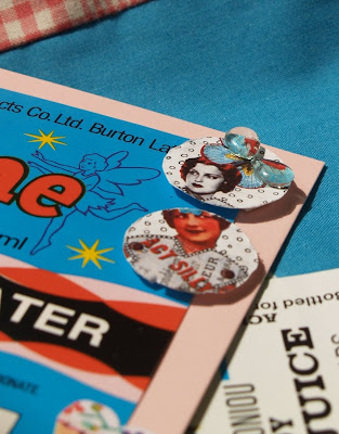
When that happens to me, I don't really mind, I like a challenge and that's when the fun / experimenting bit starts! I recently found some of these soda labels from 3DJean in my Scattered Scarlet design team parcel:
 Sometimes when I get very specifically 'themed' items, I wonder if I should put them to one side to fit with a similarly themed layout, card or project. And while one of my favourite parts of selecting supplies for a project is indeed finding appropriately matching items to help me tell the story ... it can also mean that some of those themed items get put to one side indefinitely as the 'right' project never appears! Aware of this, I now try to use them in different ways, let me show you what I mean...
 Last month, I created this layout for the Scattered Scarlet blog [you can read the original post here] which told the tale of the tiny kitchen in our holiday apartment in London:
I used one of the yellow 'Grapefruit Crush' labels on the right-hand side of the page, but this time I tore it in half and tucked it behind my photo so that only the word 'crush' remained ... which is exactly what that tiny kitchen meant to us!
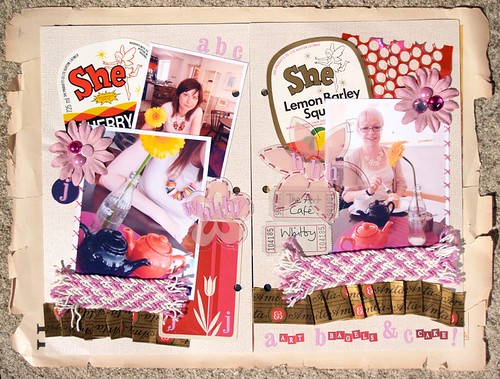
Similarly, last year I used some soda labels on this mini-album spread:
For these pages I kept the 'She' brand name visible to bring the focus of the pages on to me and my friend Hannah, plus there's a sweet fairy on the top corner of them, rather than on any link with soda!
So what this are [hopefully] demonstrating is that items of ephemera can be useful purely for the words they feature on them. Words which may be actually quite unconnected to the very specific theme they fit into into .. like soft drinks, but which may be of use to you in your project.
Finally, and most simply, you can exploit your items for their use of colour and design. That's what I decided to do with these, my latest greetings cards using 3DJean products:

Next I added the Sassafras bunting stickers [which were also from 3DJean] down the length of the card and added some Tear Drop - Dew Drops in between:


These cards could be for any occasion, or no occasion at all. To add some sort of greeting on this one I scoured one of the vintage comics Jean has for sale [here] for an appropriate phrase and found: 'the most amazing things' on a page about the Wombles! It was the perfect colour to bring out the lemon yellow of the label and adds the perfect finishing touch:
I hope that [a] I've made sense and [b] some of my examples have made you more confident in experimenting with something you've been holding on to wihtout knowing what to make with it!
Any and all links to, or stories of, your experiences are most welcome! I'm always up for a good natter about paper ...
Have a great day, hope the sun's shining on you.
Julie :)
p.s: if you've got time I'd love it if you hopped over to the Scattered Scarlet blog to see my lacy layout!


I love this -- especially the She labels!
ReplyDeleteSo so original. These are fab love the lemons
ReplyDeleteFab stuff.......very funky, Love the strong graphic look!
ReplyDeleteVintage comics? I need to check that out! Brilliant stuff Julie.
ReplyDeleteWow, that's a blast from my past. I used to live round the corner from SHE drinks factory.
ReplyDeleteLove how you've used the labels.
Great work :)
Fab layouts and cards Julie - I have a few of these labels etc tucked away, waiting... for what?! I shall have to break them out and have a go! :)
ReplyDeleteThese are fantastic!
ReplyDeleteFab stuff.......very funky, Love the strong graphic look!
ReplyDeleteI love this -- especially the She labels!
ReplyDeleteFab stuff.......very funky, Love the strong graphic look!
ReplyDeleteVintage comics? I need to check that out! Brilliant stuff Julie.
ReplyDelete