
Today is my turn to post over at the 3DJean Design Team blog and I wanted to share my project over here too ... because I like it ... and because, when I came up with the idea ... I made myself laugh [clearly I'm my own biggest fan ...].
And if you've just hopped over here from there then, don't worry, once I've stopped creasing over at my own humour ... I'll share the full step-by-step tutorial I promised.
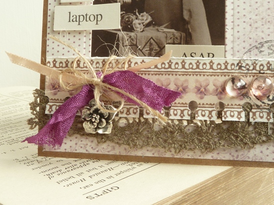
Now let me just show you what I made:

Now, let's be clear about this: the structure of the card - a 'sandwich board' is not something I designed myself. My friend Jan showed me one which, in turn, she'd seen on someone's blog ... and I've just adapted it to suit myself.
You can see better in this photo how it's constructed from a card base, with a hanging section slotted inside:

And, should you need clearer instructions than that ... I made you this:

[Word to the wise: DO NOT decorate the dangly section first and then try to fit it through the slot in the top because:
- [a] it won't fit ... and
- [b] you'll feel like an idiot when you realise it won't fit.
Anywhooooo ... I covered the hanging section of this card with one of the vintage images from a sheet of Pion paper called 'Romance - From Grandma's Attic' [stocked here at 3DJean]

This meant me sifting through a pile of K&Co 'Words To Go' until something mildly amusing began to emerge. With this one, I thought the wistful lady might be tired of handwriting letters ... and was longing for email:

And, as you'll see from the next 2 cards I'll post, this style, and these vintage images, lend themselves nicely to a brand of humour that's a tiny bit friskier too!
I can't promise you'll be barking / snorting / losing fluids laughing at them ... but if nothing else it should be a bit different. It's been pointed out to me by the friends who've seen the full set of these cards, that 'handmade card' and 'funny card' aren't necessarily spoken about in the same breath. And I suppose they're right. Which is a shame really, don't you think?
Humour cards are hugely popular in card shops so maybe we need to start fighting back with our handmade designs. I'm definitely going to make more of a conscious effort to play-up the funny from now on because if you know only 2 things about me they should surely be that I'm a pre-occupied with both papercrafting and trying to be make people laugh ... so 'funny cards' have got to be a win-win for me!
Please feel free to:
- pin the tutorial to your Pinterest boards for future reference;
- or to pin the card itself to remind you to sift through your own word labels and stickers until something makes you smile - then stick it to your next card!
Julie :-)


lovely project, love your pinterest-ready 'sidebar' type thingy. great stuff. in constant state of envy of your colour-combining/card making ideas!
ReplyDelete....and how did you stamp 'middlesburgh' on the card?....
ReplyDeleteThanks H - it's actually just a rubber stamp I found at a show once. How could I resist? :-)
ReplyDeleteLove it! Can't wait to see the others!.x
ReplyDeleteJulie, that humour is fine with me !! snort !!
ReplyDeleteFab fun card - I love the way you've punches along the top of the insert - makes it less obvious that it's just a tab and more part of the overall card IYKWIM
ReplyDeleteThat's fun... thank you for the tutorial & I love the vintage look you created.
ReplyDeleteseeing both of your cards this morning made me smile. Funny cards win every time.Brilliant idea! Love the vintage images too. Oh an great tutorial....i'd be the one decorating the swingy bit before trying to insert!! lol.
ReplyDeleteYes, pinning it for the future. Thank you for the tutorial! This whole series is so "you"nique :)
ReplyDelete